2:30
Explore
Sketch - Remember when we said auto layout was coming to Sketch? It’s here. It
Sketch · May 2025 · 0:47 · AI-annotated
- Length
- 0:47
- Scenes
- 28 · 1.7 s avg
- Product on screen
- 0:00
- Features shown
- 4
- Voiceover
- No
00:00:00 / 00:47:04
Sketch’s 0:47 launch film runs 28 scenes, about 1.7 s each. The product is on screen from the first frame and 4 features are revealed, with social proof. There is no explicit call to action. The video opens with the gem mark and a cascading 3D feature list, then walks through each feature as a short centered demo on a soft gradient canvas, using 3D keycaps to cue shortcuts. It closes on a customer quote and a final logo card.
No filming indicatedEstimated needs: 7 capture groups — your screens or recordings · 1 official logo — reused across the film · 3 graphic passages — draw or supply · 8 3D passages — build or supply
Is this your launch? to your site or press kit.
More like this
Sketch - Remember when we said auto layout was coming to Sketch? It’s here. It, scene by scene
· 28 scenes as text
01 · Product intro · 0:00–0:03
On a purple gradient, a small dark pill at the bottom grows into a horizontal command bar, and five icon slots pop in. The center slot reveals an orange gem icon with a cursor and sparkles, while feature labels cascade into view above in 3D perspective.
On-screen text: “Stacks”, “Frames & Graphics”, “Better Command Bar”, “Custom Canvas Colors”, “Flexible Text Styles”, “Markdown Styling”
Techniques: Kinetic type, Particles, Cursor demo
Camera: Static
02 · Product intro · 0:03–0:03
A purple gradient scene shows a vertical stack of rounded feature chips receding into 3D depth above a translucent dock. The center dock slot holds a white icon with an orange diamond, and a cursor points at it as the top chip slides.
On-screen text: “Markdown Styling”, “Flexible Text Styles”, “Custom Canvas Colors”, “Better Command Bar”, “Frames & Graphics”, “Stacks”
Techniques: 3D mockup
Camera: Static
03 · Product intro · 0:03–0:04
On a purple gradient, a diagonal column of white feature pills hovers above a dock with a glowing diamond icon and a cursor. Phone and panel mockups slide in from the left and right edges as the pills drift slightly.
On-screen text: “Markdown Styling”, “Flexible Text Styles”, “Custom Canvas Colors”, “Better Command Bar”, “Frames & Graphics”, “Stacks”
Techniques: 3D mockup
Camera: Static
04 · Demo · 0:04–0:05
A 2x3 grid of product screens sits on a blue gradient: a sunset photo editor, a sign-up card, a dating profile, a phone mockup, a shape being drawn, and a 3D bird in a frame. Cursors hover over toolbars while the profile scrolls.
Techniques: Split screen
Camera: Static
05 · Demo · 0:05–0:06
A six-panel grid on a blue gradient shows interface mockups: a phone with a mountain scene, a sign-up form, a dating profile, a phone with a layers panel, a hexagon drawing itself, and a bird photo under a toolbar. Cursors hover across several frames.
Techniques: Cursor demo
Camera: Static
06 · Feature reveal · 0:06–0:07
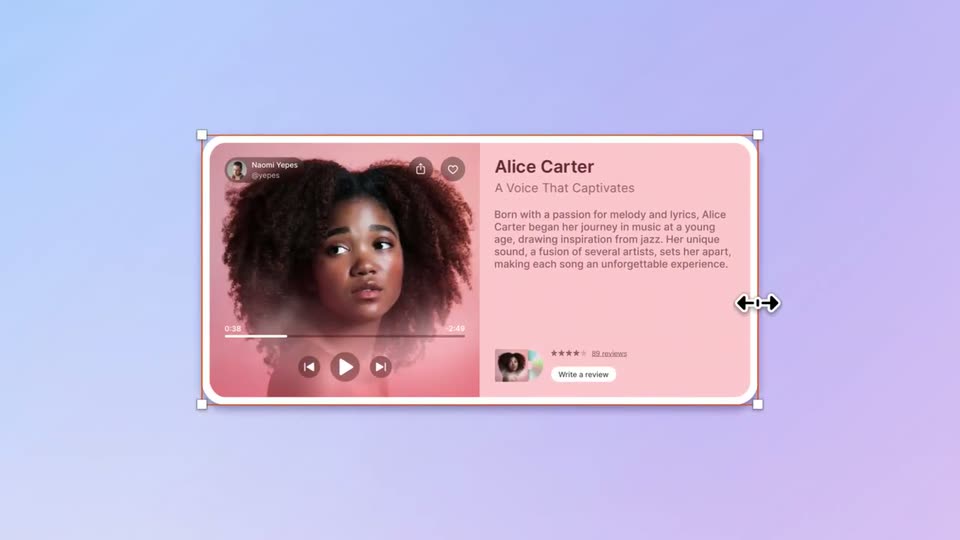
A music player card with white selection handles sits centered on a lavender gradient. A cursor at the right edge drags the double-arrow resize handle inward, the card narrows, and the bio paragraph reflows from five lines to four.
Techniques: Cursor demo
Camera: Pan
07 · Feature reveal · 0:07–0:08
A flat artist profile card, framed by a white selection box with corner handles and a resize arrow, rests on a lavender gradient. The bio text slides in line by line, then the card shifts left to reveal a column of rounded icon buttons at the right edge.
Camera: Pan
08 · Feature reveal · 0:08–0:09
On a light blue gradient, a column of white rounded action buttons reorders as a cursor drags the 'Issue a refund' row down one position. Its orange selection box and corner handles follow it while the rows above slide up to fill the gap.
Techniques: Cursor demo
Camera: Static
09 · Feature reveal · 0:09–0:10
A six-row action list with colored icons on a soft blue gradient; the third row is boxed by a selection marquee with a cursor. The list shrinks and slides left as a Frame label and a cyan dot appear, and the cursor moves right.
Techniques: Cursor demo, UI zoom
Camera: Static
10 · Feature reveal · 0:10–0:11
A horizontal row of purple, pink, blue and cyan circles slides right behind a central frosted rounded card, their colors diffusing through the glass blur. A small label reads Frame above the card on a soft lavender gradient.
On-screen text: “Frame”
Camera: Static
11 · Feature reveal · 0:11–0:12
A lavender canvas with a Frame square and a purple circle splits into a blue right half. The circle exits, the square shrinks to the top-left, and a white card with a mountain photo and a comment slides in from the right under a Card and Phone toolbar.
Techniques: Split screen
Camera: Pan
12 · Feature reveal · 0:12–0:13
On a light blue canvas, a white phone frame with a bottom icon bar sits beside a layer panel with Card highlighted in orange. A cursor drags a mountain photo card with a comment block from the right into the phone screen, landing inside an orange selection box.
Techniques: Cursor demo
Camera: Static
13 · Feature reveal · 0:13–0:14
A flat phone mockup on a light blue gradient shows a social post with a mountain photo and a comment from Jane. A layer panel at top lists Phone and Card; a cursor hovers the card, which carries white selection handles, then moves right as the selection clears.
Techniques: Cursor demo
Camera: Static
14 · Feature reveal · 0:14–0:15
A cream keyboard keycap with a Y letter scales up in the lower center over a blue-to-purple gradient, while a light symbol-library panel with a search bar and a grid of icon cards fades in behind it.
Techniques: 3D mockup
Camera: Static
15 · Feature reveal · 0:15–0:18
A white symbol-library panel with a grid of UI thumbnails sits on a blue-purple gradient, with 3D keycaps labeled Y, then Command and F, popping in front. A dropdown menu opens over the panel, then the view reframes right to a canvas where a cursor hovers a purple Search button.
Techniques: 3D mockup, UI zoom, Cursor demo
Camera: Static
16 · Feature reveal · 0:18–0:22
A purple gradient pill button on a light blue background reads “Search website”; a small inspector panel with a cursor hovers the “Icon/Search” row, the search icon on the button fades out, then the label switches to “Ask Us” and the button shrinks to fit.
Techniques: Cursor demo, Masking
Camera: Static
17 · Feature reveal · 0:22–0:25
A design app panel fills the frame; the cursor clicks to uncheck Include color and Include alignment while serif headings sit on the canvas. A hard vertical wipe then reveals a phone with a San Francisco webpage on the right.
Techniques: Cursor demo, Masking
Camera: Pan
18 · Feature reveal · 0:25–0:26
A 3D iPhone on a blue-purple gradient shows a travel page with San Francisco highlighted orange, beside a design panel whose City Title override reads San Francisco. A white key bar with a command key and a cursor key rises at the phone's base.
Techniques: 3D mockup
Camera: Static
19 · Feature reveal · 0:26–0:28
A 3D iPhone with a command key sits on a blue-purple gradient beside a flat design panel. On the phone, the San Francisco title flips from Regular to Italic as the panel's Text Style updates. A white card then wipes up across the lower half of the phone.
Techniques: 3D mockup
Camera: Static
20 · Feature reveal · 0:28–0:31
A signup card with a model photo and form fields sits on a blue canvas, selected by corner handles as two cursors hover over the fields. The selection turns pink with a size badge, then the view zooms out to reveal a dark phone mockup on the left.
Techniques: Cursor demo, UI zoom
Camera: Pan
21 · Feature reveal · 0:31–0:31
A 3D smartphone mockup displays a colorful podcast grid with a selection box and cursor on the AirSnap title. A three-key keyboard slides up from the bottom over a soft blue-purple gradient.
Techniques: 3D mockup
Camera: Static
22 · Feature reveal · 0:31–0:32
A 3D phone mockup displays the AirSnap app with a red selection box around the title and a grid of media tiles. It cuts to a flat text-style panel listing font options, while three 3D keys for option, command and R stay fixed at the bottom.
Techniques: 3D mockup
Camera: Static
23 · Feature reveal · 0:32–0:34
A white text-style search panel sits on a blue-to-purple gradient. An orange highlight border moves from the Large Title row to the bold display row as the list scrolls up, then a bottom tab bar fades in.
Camera: Static
24 · Feature reveal · 0:34–0:36
A flat phone mockup on a soft blue-to-lavender gradient shows a podcast grid of colored tiles. At the top, a dashed selection box with corner handles frames the word AirSnap while an arrow cursor edits it, flipping its case. A now-playing bar sits at the bottom.
Techniques: Cursor demo
Camera: Pull out
25 · Social proof · 0:36–0:39
A white review card slides in from the right on a lavender gradient, the quote typing out behind a blinking caret, then the quote flashes a peach highlight. The frame pulls back to seat the card below a text-formatting icon and a purple bar, an arrow cursor at top.
Techniques: Kinetic type, Cursor demo
Camera: Static
26 · Demo · 0:39–0:44
Close-up of a design tool canvas. Two cursors select circular plus buttons on a purple gradient card; the left button vanishes as orange alignment guides snap to the right one, then a resize arrow widens the card's right edge.
Techniques: Cursor demo
Camera: Push in
27 · Outro · 0:44–0:45
A faceted orange gem with a soft white halo sits centered on a blue-to-lavender gradient. The halo fades as the gem scales up from small to medium size over the half second.
On-screen text: “十”
Camera: Static
28 · Outro · 0:45–0:47
A faceted orange diamond mark sits centered on a soft blue-to-lavender gradient. The logo remains static in the frame, with a pale drop shadow beneath it and no added text or interface elements.
Camera: Static