0:48
Explore
Knock - Launch week → Day 2 Introducing Knock workflows 3.0. Rebuilt with a
Knock · Apr 2025 · 1:12 · AI-annotated
- Length
- 1:12
- Scenes
- 24 · 3.0 s avg
- Product on screen
- 0:23
- Features shown
- 3
- Voiceover
- No
00:00:00 / 01:12:17
Knock’s 1:12 launch film runs 24 scenes, about 3.0 s each. The product shows up at 0:23 and 3 features are revealed. There is no explicit call to action. The video alternates flat title cards with 3D-tilted fly-throughs of the workflow interface, each section opened by a centered headline that assembles word by word. Its signature moves are perspective push-ins with rack focus, motion-blur text streaks, and a coral accent that swaps the closing line before the logo lands.
No filming indicatedEstimated needs: 3 capture groups — your screens or recordings · 1 official logo — reused across the film · 8 3D passages — build or supply
Is this your launch? to your site or press kit.
More like this
0:51
1:03

Perplexity - Computer now connects with Plaid to link bank accounts, credit cards,
Perplexity · AI · Apr 2026
Knock - Launch week → Day 2 Introducing Knock workflows 3.0. Rebuilt with a, scene by scene
· 24 scenes as text
01 · Hook · 0:00–0:02
The word Introducing fades in on the left against a plain light gray background, then holds in a locked-off frame.
On-screen text: “Introducing”
Techniques: Kinetic type
Camera: Static
02 · Hook · 0:02–0:08
A white workflow interface tilts in 3D perspective with shallow depth of field. The view pushes in from the step list to the red Commit button, then racks out of focus. Headline phrases appear in turn: The fastest way, to create modern, product messaging.
On-screen text: “The fastest way”, “to create modern”, “product messaging”
Techniques: Kinetic type, 3D mockup, UI zoom
Camera: Push in
03 · Feature reveal · 0:08–0:10
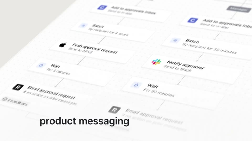
A 3D-tilted workflow canvas on a dotted grid shows connected step cards for triggers, approval checks and notifications, with Executive and Manager role tags. The view glides down the diagram while the caption product messaging stays fixed at the lower left.
On-screen text: “product messaging”
Techniques: 3D mockup
Camera: Pull out
04 · Feature reveal · 0:10–0:11
A tilted 3D workflow canvas of approval cards fills the frame with soft blur. The camera pushes in on the email editor, revealing an approval request with Approve and Reject buttons. A dark caption reads product messaging at the bottom left, then Across email appears at the top right.
On-screen text: “product messaging”, “Across email”
Techniques: 3D mockup, UI zoom
Camera: Pan
05 · Feature reveal · 0:11–0:14
A tilted 3D mockup of an email workflow editor rotates slowly, showing template fields and a live preview panel on the right. The view whips into motion blur as a phone with an orange wallpaper slides in from the top left.
On-screen text: “Across email”
Techniques: 3D mockup, Speed ramp
Camera: Pan
06 · Feature reveal · 0:14–0:17
A tilted iPhone mockup in 3D perspective sharpens into focus on a light background, its lock screen showing a Collab.io approval notification. The caption Across mobile slides in from the right, then the frame widens and a second approval card with green Approve and red Reject buttons pops in.
On-screen text: “Across mobile”
Techniques: 3D mockup, Kinetic type
Camera: Push in
07 · Feature reveal · 0:17–0:19
A Slack approval card rests centered on a light gray field under the headline Across Slack. The clip opens mid-transition, a blurred Across mobile title and a phone sliding out as the new title resolves from a doubled ghost into one line.
On-screen text: “Across Slack”
Camera: Static
08 · Feature reveal · 0:19–0:20
A wide layout pans left, carrying the headline Across Slack and a Slack approval card off the left edge while a workflow editor and two approval-request cards slide into view from the right.
On-screen text: “Across Slack”
Camera: Pan
09 · Feature reveal · 0:20–0:21
A light gray backdrop holds a flat product interface: a workflow editor on the left and an approval preview card on the right. Above it, a bold black headline builds word by word into a single centered line.
On-screen text: “across your product”
Techniques: Kinetic type
Camera: Static
10 · Feature reveal · 0:21–0:23
A light gray frame pairs the headline “across your product” with a flat screenshot of a workflow editor. The left panel shows a markdown body with template variables and a button field; the right panel shows an approval card with Approve and Reject buttons. The shot stays locked-off and static.
On-screen text: “across your product”
Camera: Static
11 · Product intro · 0:23–0:25
A static light gray card displays the centered line with Knock workflows 3.0 in dark gray sans. The text stays locked in place for the entire shot, with no motion or additional elements.
On-screen text: “with Knock workflows 3.0”
Camera: Static
12 · Feature reveal · 0:25–0:27
A static dark-gray headline holds center on a pale gray field while a line of text streaks left to right beneath it, smeared by motion blur to suggest speed.
On-screen text: “Built for speed”, “with Knock workflows 3.0”
Techniques: Kinetic type
Camera: Static
13 · Feature reveal · 0:27–0:29
A workflow interface is shown in 3D perspective. A cursor drags a node down into a branch. A black box with a white down arrow appears in the bottom right.
Techniques: 3D mockup, Cursor demo
Camera: Static
14 · Feature reveal · 0:29–0:29
A tilted 3D view of a workflow builder on a white plane glides across the node diagram and a right-hand settings panel, then reframes on a message template editor. A black rounded badge in the lower corner switches from a down arrow to the letter e.
Techniques: 3D mockup
Camera: Static
15 · Feature reveal · 0:29–0:33
A tilted 3D interface of a workflow builder floats on a light gray field. The view pans down the node diagram, from the markdown editor past approval and wait nodes to the End block, while a black rounded badge in the corner swaps a logo for a down arrow.
Techniques: 3D mockup, UI zoom
Camera: Static
16 · Feature reveal · 0:33–0:34
A tilted 3D perspective of a workflow builder on a dotted grid, with connected nodes for batch, push approval, wait, and email steps, plus a right-hand settings panel and a dark rounded panel at the lower right. The frame stays locked.
Techniques: 3D mockup
Camera: Static
17 · Feature reveal · 0:34–0:35
A 3D perspective email workflow interface, editor and preview side by side, fades out on a light gray field. The centered line Built for your entire team fades in word by word, Built in bold dark gray, the rest in lighter gray.
On-screen text: “Built for your entire team”
Techniques: 3D mockup, Kinetic type
Camera: Static
18 · Feature reveal · 0:35–0:37
On a plain light gray background, the centered headline 'Built for your entire team' sits in black sans-serif. The phrase holds its position while the words 'entire team' fade from light gray to solid black over the first second.
On-screen text: “Built for your entire team”
Techniques: Kinetic type
Camera: Static
19 · Feature reveal · 0:37–0:40
A white email editor view opens with the From field and a Content tab. A cursor moves to the plus and grid icons and clicks, opening an Insert block dropdown listing Markdown, Blockquote, HTML, Button set, Divider and Partial, then hovers over Blockquote.
Techniques: Cursor demo
Camera: Pull out
20 · Feature reveal · 0:40–0:42
A cursor moves down an Insert block dropdown in an email editor, then the frame pulls back to reveal the full code editor on the left beside a rendered approval email on the right.
Techniques: Cursor demo, UI zoom
Camera: Pull out
21 · Feature reveal · 0:42–0:44
A light-gray screen shows an email editor with a live preview pane on the right, set under the headline with side-by-side previews. The headline darkens from gray to black, then the view zooms into the preview pane as the headline exits.
On-screen text: “with side-by-side previews”
Techniques: UI zoom
Camera: Push in
22 · Feature reveal · 0:44–0:46
A dark gray headline fades in word by word above a white email-preview tool showing three client previews, Outlook, iOS Outlook and Android Outlook. The camera then zooms into the panel, enlarging the preview cards and the editor controls.
On-screen text: “across every email client”
Techniques: Kinetic type, UI zoom
Camera: Static
23 · Feature reveal · 0:46–0:57
A cursor flips the editor toggle to Visual editor and the frame pulls back from a close-up to the full code view. As a typeahead dropdown, a red error line, and an AI fix panel appear, bold captions enter word by word.
On-screen text: “with typeahead support”, “Inline error handling”, “and AI assist”
Techniques: Cursor demo, UI zoom, Kinetic type
Camera: Pull out
24 · Outro · 0:57–1:12
A plain light-gray frame holds the static black line 'Built for teams to' at left, while a coral second line swaps in place between 'move faster', 'drive consistency' and 'ship with confidence'. The text fades out, then the black 'knock' wordmark with a coral dot fades in at center.
On-screen text: “Built for teams to”, “move faster”, “drive consistency”, “ship with confidence”, “knock”
Techniques: Kinetic type
Camera: Static