0:32

Canva - PSA 📣 You can now turn your ChatGPT-generated images into fully edita
Canva · Design · Jun 2026
Genspark · Jun 2026 · 1:23 · AI-annotated
Genspark’s 1:23 launch film runs 36 scenes, about 2.3 s each. The product is on screen from the first frame and 7 features are revealed. There is no explicit call to action. A linear workflow tour where each step opens on a typed prompt card, pulses through a sparkle 'Designing...' state, and resolves into mockups that snap into place on cream gradients. Pacing is brisk at about three cuts per minute, with hand-drawn blue circles and a recurring butterfly as the signature moves.
Is this your launch? to your site or press kit.
Canva · Design · Jun 2026
Craft · Productivity · Nov 2025
A pale cream gradient frames the Genspark Design logo above a white prompt card. The prompt text types out, then a mouse cursor moves to the return button in the corner and clicks it.
Techniques: Cursor demo
Camera: Push in
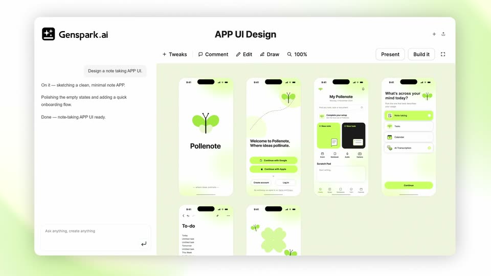
A flat Genspark.ai window sits on a soft green gradient. The left chat panel types three status lines in sequence while the canvas replaces a 'Designing...' label with a grid of green phone mockups that fade in.
Camera: Push in
A prompt box reading “Dont’t really like the green... Add more colors to it” fills the frame over blurred green phone mockups; a cursor clicks the send arrow, then the camera pulls back and slides right to expose the generated To-do and onboarding screens.
Techniques: Cursor demo, UI zoom
Camera: Push in
The design tool canvas zooms in from a wide grid of phone screens to two close-up screens, a to-do list and a welcome screen with a green clover. The caption Designing... fades in at center right beside a four-pointed sparkle icon.
On-screen text: “Designing...”
Techniques: UI zoom, Kinetic type
Camera: Pull out
In the Genspark editor, a pale green canvas shows a sparkle icon beside the word Designing, which fades out as four smartphone mockups fade in, revealing the Pollenate app's welcome and profile screens.
Camera: Static
A light design-tool window titled APP UI Design shows a row of Pollenote mobile screens. A prompt box slides in at the bottom right with the text Give it a playful illustrated look, a cursor rests at its corner, then the frame zooms into the canvas of phone mockups.
Techniques: Cursor demo, UI zoom
Camera: Static
A light Genspark.ai window holds a blurred canvas with a “Designing…” status and a sparkle icon, then the canvas resolves into a grid of Pollenote phone screens that snap into place.
Camera: Push in
Three Pollenote phone screens line up; the left two fade out as the right screen, with Note taking highlighted, slides to center and enlarges. A cursor then selects the heading, opening a TEXT EDIT panel with font, color and weight controls.
Techniques: Split screen, UI zoom, Cursor demo
Camera: Pan
A cursor drags the color picker in an edit panel, turning the italic words 'mind today?' on a tilted phone from black to burnt orange. The panel closes and the frame settles on the centered phone.
Techniques: Cursor demo, UI zoom
Camera: Static
A close-up of a light toolbar shows an Edit button, a Draw button and a 100% zoom control. A black arrow cursor moves from the lower right up to Draw, which fills with a gray rounded highlight on hover.
Techniques: Cursor demo
Camera: Static
A flat phone mockup of a to-do app on a cream background. A cursor draws a blue circle in the empty space, a white callout types 'Add a formatting editor here', then a formatting toolbar with highlighted buttons appears at the bottom. The frame pans down to a second phone.
On-screen text: “Add a formatting editor here”
Techniques: Cursor demo
Camera: Static
A phone mockup rotates from a 3D tilt to a flat front view of the Pollenote home screen. A cursor draws a hand-sketched blue circle at the top right, then a white input box slides in and types the words Add a dark mode.
Techniques: 3D mockup, Cursor demo
Camera: Pan
A phone mockup in 3D perspective shows the Pollenote home screen. A white callout card reading Add a dark mode toggle sits to the right. A cursor moves up and taps beside the bell icon, where a moon icon appears as the card fades.
On-screen text: “Add a dark mode toggle”
Techniques: 3D mockup, Cursor demo
Camera: Pan
A single phone mockup of the Pollenote app sits centered on a gray field, then the view pulls back to reveal three phones side by side, each showing a different screen: a pink welcome page, a dark home with a modal, and a cream to-do list.
Techniques: UI zoom
Camera: Pull out
Four phone mockups snap into a row, their screens showing onboarding and task views. The set then expands into a two-by-six grid, pairing each light-themed screen with a dark-themed version on a flat gray field.
Camera: Pull out
A cream gradient background holds the large dark title “Design system”, which scales down as a white rounded input field rises beneath it, carrying the Genspark Design logo and the prompt “Create my design system” with an enter icon.
On-screen text: “Design system”
Techniques: Kinetic type
Camera: Static
On a warm cream gradient, the Genspark Design logo slides in above a centered white prompt box reading “Create my design system based on the UI.” A cursor glides in from the right and taps the small circular enter button, which flashes gray.
Techniques: Cursor demo
Camera: Pan
The Genspark.ai editor shows a Design System document in a Creating... state, then generated content fills the canvas with logo, color and button samples. The canvas scrolls down through typography and icon sections, then reframes to present the whole document as a card with the caption My design system.
On-screen text: “My design system”
Techniques: UI zoom
Camera: Static
A rounded card holding a design-system sheet (butterfly logo, type scale, color swatches, button states) sits on a soft peach gradient. The card scales up and drifts left while the footer title 'My design system' grows and a thin rounded outline forms around it.
On-screen text: “My design system”
Techniques: Kinetic type
Camera: Pull out
A close-up of a white search field with a butterfly icon and the text My design system zooms out to reveal the Genspark Design logo above it. A cursor moves to the right edge of the field as the text Create a launch landing page for the APP is typed into the box.
On-screen text: “My design system”, “Create a launch landing page for the APP”, “Genspark Design”
Techniques: UI zoom, Cursor demo, Kinetic type
Camera: Pull out
A rounded prompt card holding the typed request and a design-system dropdown floats over the Genspark canvas, then slides away, leaving the centered “Designing…” status with pulsing sparkle icons on a beige background.
Camera: Pan
The Genspark.ai builder window holds still while the landing page inside scrolls down from the hero, past a row of feature cards, to a gradient section with an illustration, where it comes to rest.
Camera: Pan
The Genspark.ai design tool frames a landing page canvas on a purple-to-peach gradient. The headline Built for the way you think fades in at the top while a stack of feature cards, each with its own copy and a noodle-bowl illustration, scales up and locks into a vertical pile.
Camera: Static
A Genspark.ai editor window shows a landing page on a purple to pink gradient. The view slowly zooms into the page, where a cream card reads 'Catch ideas before they fly away.' beside a noodle bowl illustration.
Techniques: UI zoom
Camera: Pull out
The words “Demo video” sit centered in a dark sans-serif on a cream field with a soft pink glow in the top right corner. The text starts large and shrinks steadily toward the center as the clip runs.
On-screen text: “Demo video”
Techniques: Kinetic type
Camera: Static
On a soft pink gradient, a black app icon and Genspark Design sit above a white rounded input field reading Create a product demo video, with a return-arrow button at its lower right. A cursor enters from the right and hovers the button as the group drifts upward.
Techniques: Cursor demo
Camera: Static
A product window slides into the center and locks off on a cream background. Its beige canvas shows a dark four-point sparkle beside the word Creating and a fading ellipsis. The header carries the Genspark.ai mark and a row of small toolbar labels.
Camera: Static
The Genspark.ai editor window plays a demo video of the Pollenote app on a flat smartphone mockup. A cursor clicks the play button, then the video runs through a welcome illustration, a home screen and a new note, while the left caption switches from Welcome to Take notes.
Techniques: Cursor demo
Camera: Static
A Genspark.ai editor window displays a landing page design. The view reframes from a phone mockup with a video player bar to the headline section with a play button, while a two-line title fades in at the top center.
On-screen text: “Landing Page Design”, “Product Demo Video”
Techniques: UI zoom
Camera: Pull out
A design tool window labeled Landing Page Design holds a pastel landing page mockup. The page shows the headline Where ideas pollinate. above app store buttons, with a phone displaying a notes screen and a white play button centered over it. The frame stays still.
Camera: Push in
A rounded “Build it” button sits centered on a cream background. A black arrow cursor glides in from the lower right and comes to rest on the button.
Techniques: Cursor demo
Camera: Push in
A rounded white code-editor card sits on a soft beige field; its header holds still while syntax-highlighted JavaScript scrolls upward inside it. The card then fades out as a flat phone mockup and the word APP slide into the center.
On-screen text: “APP”
Techniques: Kinetic type
Camera: Static
A phone mockup labeled APP sits center on a cream background, then slides left as a tilted browser window labeled Website fades in on the right. The browser shows a hero line and a play button over a small illustration.
On-screen text: “APP”, “Website”
Techniques: 3D mockup
Camera: Static
On a cream background, a phone mockup and a browser window sit side by side under the black labels APP and Website, which slide down into place. The app shows a list of options; the website displays the headline Where ideas pollinate. scaling up over a pastel gradient.
On-screen text: “APP”, “Website”
Techniques: Kinetic type, Split screen
Camera: Static
Three flat mockups sit side by side on a cream background: a phone with an app list, a browser window with a pastel website, and a video player holding a phone. The labels APP, Website, and Video slide apart into place above each mockup as the mockups settle slightly downward.
On-screen text: “APP”, “Website”, “Video”
Techniques: Kinetic type, Split screen
Camera: Pull out
The Genspark Design lockup, a black rounded-square icon with white sparkles beside a black wordmark, sits centered on a cream background with a soft warm glow in the top right. It eases slightly into center at the start, then holds still for the rest of the clip.
On-screen text: “Genspark Design”
Camera: Static