1:10
Explore
Penpot - 💥 Penpot 2.0 is now available! Explore & enjoy the unique featur
Penpot · Apr 2024 · 1:44 · AI-annotated
- Length
- 1:44
- Scenes
- 51 · 2.0 s avg
- Product on screen
- 0:06
- Features shown
- 3
- Call to action
- 1:33 · 90%
- Voiceover
- Yes
00:00:00 / 01:44:06
Penpot’s 1:44 launch film runs 51 scenes, about 2.0 s each. The product shows up at 0:06 and 3 features are revealed. The call to action lands at 1:33 (90% in), over a voiceover. The video is a feature-led launch reel: a neon-desk hook, a logo reveal, three back-to-back feature demos (grid, components, code), a value/interface overview, then a free-forever closer and a URL end card. Its signature style is flat UI panels and big gradient words framed by selection boxes and measurement pills, cut at a brisk tempo with white-flash and 3D-tilt transitions on a navy, white and teal palette.
Footage neededEstimated needs: 5 capture groups — your screens or recordings · 1 official logo — reused across the film · 2 filmed passages — shoot, supply or replace · 9 graphic passages — draw or supply · 5 3D passages — build or supply
Is this your launch? to your site or press kit.
More like this



Penpot - 💥 Penpot 2.0 is now available! Explore & enjoy the unique featur, scene by scene
· 51 scenes as text
01 · Hook · 0:00–0:02
A thin black rectangular outline sits on a soft blue-to-purple gradient. The URL www.penpot.app fills the box, then the entire frame scales down to a small centered size.
On-screen text: “www.penpot.app”
Techniques: Kinetic type
Camera: Static
02 · Hook · 0:02–0:06
A 3D rendered desk in a neon-lit studio, a monitor centered on the frame. A black line-art pencil icon sits on a bright screen that shifts between pink and cyan tints. Near the end the screen darkens and the pencil is replaced by a white spiky crystal shape.
On-screen text: “www.penpot.app”
Techniques: 3D mockup, Kinetic type
Camera: Push in
03 · Product intro · 0:06–0:07
A bright white burst flashes at the center of a dark navy field, scattering glowing line-drawn doodles, squiggles, circles, and pencils outward. The flash fades and a wireframe cube is drawn in the center.
Techniques: Particles
Camera: Static
04 · Product intro · 0:07–0:11
A white line-art box fills with pens as the penpot wordmark slides in, then the logo rises and shrinks above a large cyan 2.0 that fades in inside a selection frame.
On-screen text: “penpot”, “2.0”
Techniques: Kinetic type
Camera: Push in
05 · Product intro · 0:11–0:12
A dark rounded toolbar with eight line icons, the cursor highlighted in teal, slides right across a plain white background until its left edge exits the frame. The Penpot 2.0 wordmark then appears, the name sliding in.
On-screen text: “penpot”, “2.0”
Camera: Static
06 · Product intro · 0:12–0:14
A dark assets panel with a glowing violet outline sits on a pale background. It eases in from a doubled edge, settles centered, then drifts upward so the lower library rows slide out of frame.
Camera: Static
07 · Product intro · 0:14–0:17
On a white background, a dark code panel framed by a thin pink border slides in from the right. It shows a CODE tab, a COPY ALL CODE bar, and CSS plus HTML snippets with syntax highlighting.
Camera: Static
08 · Feature reveal · 0:17–0:20
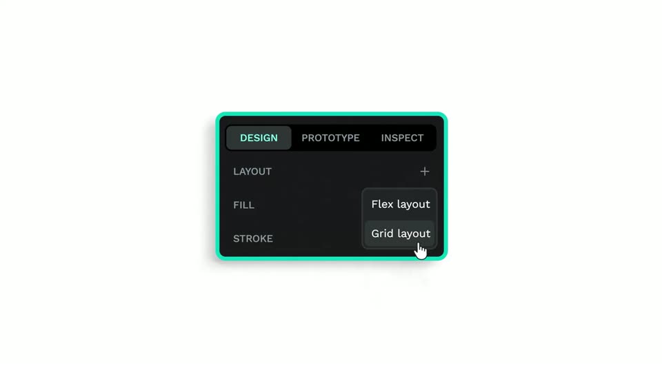
A dark properties panel with a teal border sits on white, its labels decoding from scrambled glyphs into clean text. A white hand cursor taps the plus icon on the Layout row, opening a dropdown with Flex layout and Grid layout, then hovers Grid layout as the panel scales up.
Techniques: Cursor demo, UI zoom
Camera: Static
09 · Feature reveal · 0:20–0:21
A 2x2 grid of potted cactus photos sits on the left, enclosed in a selection box. A dark settings panel slides in from the right edge, displaying a layout menu and grid editing controls.
Camera: Static
10 · Feature reveal · 0:21–0:23
A 2x2 grid of cactus photos and a dark layout panel sit side by side. A white cursor clicks the Edit Grid button, then the frame zooms onto the panel revealing column and row settings, as pink measurement guides outline the grid.
Techniques: Cursor demo, UI zoom
Camera: Static
11 · Feature reveal · 0:23–0:25
A dark design tool interface shows a two-by-two grid of cactus photos on a light canvas, framed by pink dimension markers. The right panel scrolls down to reveal column and row settings, while a cursor hovers over a plus button.
Techniques: Cursor demo
Camera: Static
12 · Feature reveal · 0:25–0:25
A grid editor fills the frame: on the left, six cactus photos sit in a pink 3x2 grid with measurement labels, on the right a dark panel lists Columns and Rows controls. A hand cursor hovers over the plus buttons, moving from the top row to the bottom.
Techniques: Cursor demo
Camera: Static
13 · Feature reveal · 0:25–0:27
A grid of six cactus photos with pink measurement overlays sits beside a dark properties panel listing Columns and Rows; a cursor hovers over the plus button. The panel drops away and the grid zooms out, shrinking to a small square at the center of a white field.
Techniques: Cursor demo
Camera: Pull out
14 · Feature reveal · 0:27–0:28
A flat layout canvas shows two image columns split by a white gutter, with pink column-count tags and a black width arrow above it. The two tags slide together and merge into one, the arrow contracts, the pink dimension label ticks from 195 PX to 180 PX, and the columns below shift to the new width.
On-screen text: “195 PX”, “3”, “180 PX”
Techniques: Morph
Camera: Pan
15 · Feature reveal · 0:28–0:29
A design-tool screen shows a pink spacing rail on the left with a numbered tag and a vertical dimension arrow, beside a card holding a tag icon and the value 15.9. As the layout adjusts, the arrow, guide lines and a cyan panel shift while the property numbers update.
Camera: Static
16 · Feature reveal · 0:29–0:30
A close-up of a flat pink interface panel: a tag label with the number 3 slides down, the vertical readout changes from 161 PX to 150 PX, and a black double arrow shrinks. A black tag icon rests in a pink box on the right.
Camera: Static
17 · Feature reveal · 0:30–0:30
A product page layout sits inside a pink grid editor with numbered row and column markers. A vertical double-headed arrow in the left column bounces as a row is resized, while photos of potted cacti and a bottom row of price and cart buttons stay fixed.
Camera: Push in
18 · Feature reveal · 0:30–0:31
A flat layout grid on white shows three potted plants in teal, pink and blue panels, each enclosed by thin pink selection lines with square corner handles. Pink constraint labels and numbered margin badges sit to the left, easing in slightly.
Camera: Static
19 · Feature reveal · 0:31–0:33
A product page mockup of a potted cactus sits on white, framed by pink 1FR and 180PX measurement ticks. A green selection box snaps onto the main image as the right column swaps its thumbnails for a code panel showing CSS and HTML.
Techniques: UI zoom
Camera: Pan
20 · Feature reveal · 0:33–0:35
A product card with teal selection handles and cactus photos sits on the left while a 3D phone with a teal edge on the right displays a dark code panel with CSS and HTML tabs. The two elements slide toward the center against a plain white background.
Techniques: 3D mockup
Camera: Pull out
21 · Feature reveal · 0:35–0:39
A black “Sign In” pill button on a white canvas gains a purple selection box and a cursor; the button scales up. A dark “Create component” tooltip with a Ctrl K shortcut pops in top right, a hand cursor taps it, and a small diamond icon appears above the button.
Techniques: Cursor demo
Camera: Static
22 · Feature reveal · 0:39–0:48
A black pill button labeled Sign In multiplies into a vertical stack of four on a white canvas. The cursor drags the label to Start Exploring, then clicks through the variants, toggling selection handles and fills from black to outline and purple.
Techniques: Cursor demo
Camera: Static
23 · Feature reveal · 0:48–0:49
Four pill buttons labeled Start Exploring stack vertically in black, outlined, solid indigo, and indigo-outline styles on a light panel. The whole group pulses in scale while a cursor sits at the lower right.
Camera: Static
24 · Feature reveal · 0:49–0:50
A light panel of button components sits behind a large 'Design Systems' title, then both fade into a flat browser mockup of a Trendverse page with a component-swap panel on the right and a cursor hovering a button.
On-screen text: “Design Systems”
Techniques: Cursor demo
Camera: Pull out
25 · Feature reveal · 0:50–0:53
A tilted browser mockup shows the Trendverse landing page with a pink gradient and red-orange wave, plus a dark component panel on the right. A cursor clicks a row in the panel, and the Start Exploring button on the page switches from a solid black pill to a transparent outline.
Techniques: 3D mockup, Cursor demo
Camera: Static
26 · Feature reveal · 0:53–0:54
On a dark navy background, the lavender wordmark 'and devs' between teal angle brackets scales up from small to full size in the center of the locked-off frame, then a small 'Start Exploring' caption scales in below it.
On-screen text: “< and devs>”, “Start Exploring”
Techniques: Kinetic type
Camera: Static
27 · Feature reveal · 0:54–0:55
A black pill tab bar with a violet outline hovers over a white field marked by faint vertical wireframe lines. A hand cursor eases onto the rightmost INSPECT tab, shown in gray with teal text, while the other tabs stay dark.
On-screen text: “< and devs>”
Techniques: Cursor demo
Camera: Static
28 · Feature reveal · 0:55–0:56
A dark inspect panel with a purple border sits on a white background; it slides right as a light design panel fades in beside it, listing size, fill and grid layout values. A white cursor rests on the panel.
Camera: Pan
29 · Feature reveal · 0:56–0:59
A design tool view shows a phone mockup of a travel app beside a properties panel. Pink 20px spacing labels frame the mockup. A cursor clicks the CODE tab, swapping the panel from layout properties to CSS and HTML code.
Techniques: Cursor demo
Camera: Pan
30 · Feature reveal · 0:59–1:03
On a white-and-lavender split background, three dark code editor cards for CSS, SVG and HTML pop in one by one across the top, each dropping a matching logo tile onto the purple band below, then the whole composition zooms in to fill the frame.
Techniques: UI zoom
Camera: Pull out
31 · Other · 1:03–1:05
On a dark indigo field, the phrase True Ownership builds in the center. Letters slide in and overlap, shifting from pink to light blue until the line settles into a single color.
On-screen text: “True Ownership”
Techniques: Kinetic type
Camera: Static
32 · Other · 1:05–1:07
On a plain off-white background, the centered line builds in from left to right, “open-source” in teal and the rest in dark navy, settling as “An open-source design tool.” The frame stays locked off while the words appear in sequence.
On-screen text: “True Ownership”, “An open-source design tool”
Techniques: Kinetic type, Masking
Camera: Static
33 · Other · 1:07–1:08
A white canvas holds a purple double-headed arrow that stretches wide as a cursor icon rests at its right end. On the left, a photo of a person scales up inside a cyan selection frame with the label Designers.
On-screen text: “An open-source design tool”, “N”
Camera: Static
34 · Other · 1:08–1:10
Two square video clips on a white background, a woman labeled Designers on the left and a man labeled Developers on the right, are joined by a purple double-headed arrow. The arrow contracts as the clips slide inward until they meet at the center.
On-screen text: “Designers”, “Developers”
Camera: Static
35 · Other · 1:10–1:11
Two small video clips labeled Designers and Developers sit left and right on a white field, each framed by cyan selection handles. A purple connector line between them bends from a straight double arrow into an angled path.
On-screen text: “Designers”, “Developers”
Techniques: Morph
Camera: Static
36 · Other · 1:11–1:12
A clip of a man in profile and a smiling woman with glasses holds a small center frame on a white field, ringed by rotating outline shapes: a blue circle, blue and green squares, a purple pencil and a pink zigzag. The word Developers scales in around it.
On-screen text: “Developers”
Camera: Static
37 · Demo · 1:12–1:13
A white canvas holds a selected photo of two smiling people, framed by outlined shapes: a blue circle, teal and blue squares, a purple pencil, and a pink zigzag. The photo scales down, then the view pulls back to reveal the full Penpot interface with left and right panels.
Techniques: UI zoom
Camera: Pull out
38 · Demo · 1:13–1:17
A browser mockup of the Penpot design tool floats in 3D perspective on a light gray field. Its white canvas holds a video clip of two people, one holding a camera, framed by selection handles and scattered vector shapes. The window eases from a tilt toward the front.
On-screen text: “www.penpot.app”
Techniques: 3D mockup
Camera: Pull out
39 · Demo · 1:17–1:18
A dark design canvas shows several mobile app frames. A black context menu opens in the center, its rows resolving from a blurred double into a crisp list, while a hand cursor hovers over the bottom option.
Techniques: Cursor demo
Camera: Static
40 · Demo · 1:18–1:19
A design tool workspace fills the frame, showing a black-and-white mobile app layout on the canvas. A dropdown menu opens in the center while a hand cursor hovers over the Switch to dark theme row.
Techniques: Cursor demo
Camera: Pan
41 · Demo · 1:19–1:21
A design tool's layout panel sits on the right of a white canvas, showing grid and flex controls. The cursor glides in from the left and hovers over the EDIT GRID button as extra grid rows shift into view.
Techniques: Cursor demo
Camera: Static
42 · Demo · 1:21–1:23
A dark file-tree panel occupies the left half, listing monospace folder paths and repeated 'Board' rows, while a blank white panel fills the right. At the start the labels cross-fade and slide into place, then the view holds still.
Camera: Static
43 · Demo · 1:23–1:23
The word Design in bold teal gradient type grows from small to full size inside a purple selection box with corner handles, over an off-white background with faint cyan wireframe lines that drift slowly.
On-screen text: “Design”
Techniques: Kinetic type, Parallax
Camera: Static
44 · Demo · 1:23–1:25
Dark navy canvas with dashed cyan guides. The pink serif word Code sits in a cyan selection box while pink 60PX pills on crosshairs mark its spacing; the side pills ease outward, then Design and Developer slide in.
On-screen text: “Code”, “60PX”, “Design”, “Developer”
Techniques: Kinetic type
Camera: Static
45 · Demo · 1:25–1:26
A teal curved band scales up at center, masking in the bold dark word Together. Three rounded role labels, Developer, Designer and UX Writer, slide in from the corners, each trailing a colored arrow that points to the word.
On-screen text: “Together”, “Developer”, “Designer”, “UX Writer”
Techniques: Kinetic type, Masking
Camera: Static
46 · Pricing · 1:26–1:29
The white line-art penpot mark, an open box with pencils, starts centered on dark navy, then shrinks and slides to the upper left beside the penpot wordmark. The mint-green 2.0 scales up below inside a selection frame with four corner handles.
On-screen text: “2.0”
Techniques: Kinetic type
Camera: Push in
47 · Pricing · 1:29–1:30
The word Free in bold blue-to-cyan gradient sans-serif scales in at center on a white background; a thin teal rectangle draws itself around it as the F shifts to purple, then penpot 2.0 scales in.
On-screen text: “Free”, “penpot”, “2.0”
Techniques: Kinetic type
Camera: Static
48 · Pricing · 1:30–1:32
The word Forever in bold pink sans sits centered inside a thin teal rectangle on a dark navy background. White and cyan 3D primitives, cylinders, cones and a cube, burst outward from behind the letters.
On-screen text: “Forever”
Techniques: Particles
Camera: Static
49 · Pricing · 1:32–1:33
A bright white flash with a central star flare clears to reveal a 3D rendered desk at night, neon lights glowing in the background. The monitor shows the penpot logo on a soft gradient, the wordmark sliding in.
Techniques: Light sweep, 3D mockup
Camera: Pull out
50 · CTA · 1:33–1:35
A monitor on a desk in a neon-lit studio shows the penpot logo on a pale screen, then the display switches to a dark end card with the logo at top, the headline Try 2.0 release and the URL www.penpot.app.
On-screen text: “Try 2.0 release”, “www.penpot.app”
Camera: Static
51 · CTA · 1:35–1:44
A dark indigo end card holds: the Penpot logo and wordmark above a bold white headline, a teal URL, six teal social icons, and a small tagline over a thin line with two figures and a gift box. The logo slides in, then the frame stays locked.
On-screen text: “penpot”, “Try 2.0 release”, “www.penpot.app”, “Where designers and developers feel at home”
Camera: Static