0:19

Cursor - Cloud agents now start 3x faster so you can hand them ambitious, long
Cursor · Developer tools · Aug 2026
LTX Studio · Feb 2026 · 0:41 · AI-annotated
LTX Studio’s 0:41 launch film runs 27 scenes, about 1.6 s each. The product shows up at 0:00 and 1 feature is revealed. There is no explicit call to action. A single-feature launch built as a two-beat title hook, then one long Brand Kits demo made of blur-to-focus UI close-ups, cursor clicks and floating asset tiles that orbit into rings, punctuated by big white display words over live-action candle shots, and closed by the Ltx wordmark. Pacing runs at roughly 16 cuts per minute with signature moves of zoom-blur transitions, cursor-led navigation and asset cards snapping into grids.
Is this your launch? to your site or press kit.
Cursor · Developer tools · Aug 2026
Runtime · B2B · Nov 2026
Polar Browser · Sep 2026
A person in a blue knit sweater sits on a blue block amid lit taper candles and abstract shapes against a blue wall. The white word INTRODUCING scales up across the center of the frame.
On-screen text: “INTRODUCING”
Techniques: Kinetic type
Camera: Pull out
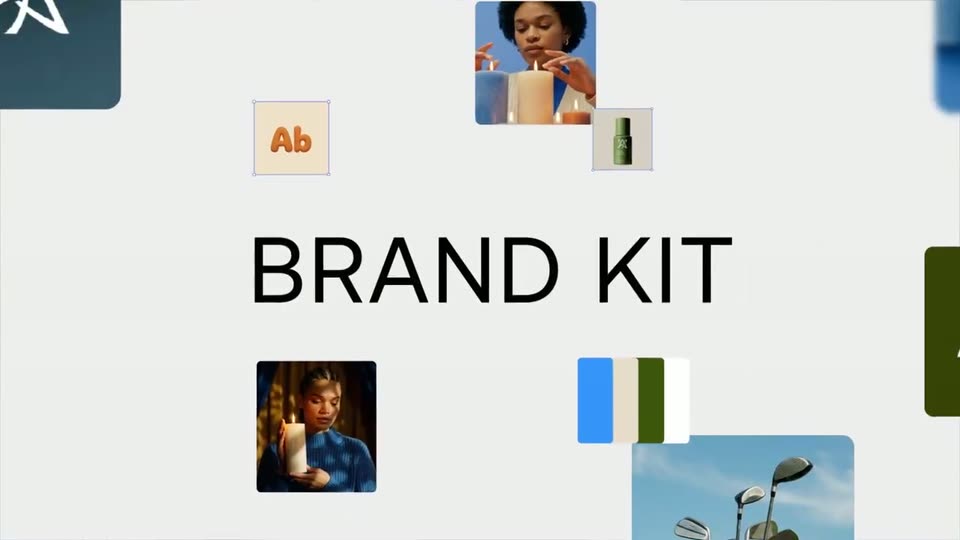
Floating brand elements, a candle photo, green bottles, color chips and an orange Ab tile, slide in around the edges of a pale gray field while BRAND sharpens from a blur at center and KITS scales in beside it.
On-screen text: “BRAND KITS”
Techniques: Kinetic type
Camera: Pull out
Brand asset tiles (logos, photos, color swatches) drift around a large BRAND KIT headline on a light gray field. The headline scales out as the Ltx app panel slides in from the right, revealing the Projects view with its sidebar.
On-screen text: “BRAND KIT”
Techniques: Kinetic type
Camera: Pull out
A product dashboard with a left navigation menu is shown, then the view zooms in and blurs the background, isolating the Brand Kits menu item in a floating card under a hovering cursor.
Techniques: UI zoom
Camera: Push in
A blurred app view shows a cursor resting on a Brand Kits menu row, then the frame reframes into the Brand Kits page where a dashed New Brand Kit card sits centered and the cursor glides toward it.
Techniques: Cursor demo, UI zoom
Camera: Pull out
A blurred product interface with a left sidebar and a 'Brand Kits' heading sharpens into focus as a cursor glides to a white card marked 'New Brand Kit', then the view zooms into the card.
Techniques: Cursor demo, UI zoom
Camera: Static
A white Brand Kit form card floats over a close-up of a watered plant. The view zooms into the card, then a cursor glides across the leaves to the blue Save button and clicks it, dismissing the form.
Techniques: UI zoom, Cursor demo
Camera: Pan
A loose cluster of asset cards, each with selection handles, orbits into a clean oval ring around the centered headline. The ring then scatters as the shot cuts to a white Brand Kit panel with floating asset chips on a blurred blue backdrop.
On-screen text: “All your brand assets in one place”
Camera: Pull out
A white brand-kit card floats over a blurred colorful background, showing the Lightricks logo, image grid and color swatches. The view zooms into the left panel as a cursor moves onto the New Element button, while the caption Reuse them across all your projects appears at left.
On-screen text: “Reuse them across all your projects”
Techniques: UI zoom, Cursor demo
Camera: Push in
A locked-off grid of color swatches and lifestyle photos slides upward, hex labels moving with the tiles, then the word TOTAL fades in large across the center of the grid.
On-screen text: “TOTAL”
Camera: Pan
A lit cream candle on a flat blue background, centered, with the word TOTAL in white across its body. The shot opens as a small bordered inset over other footage, then zooms in to fill the frame and holds. The flame flickers.
On-screen text: “TOTAL”
Camera: Static
On a light gray canvas, scattered brand photos, color swatches and a color picker drift apart while blue selection boxes snap onto some of them. A cursor appears at the bottom right and the black title BRAND CONTROL scales in at the center.
On-screen text: “BRAND CONTROL”
Techniques: Kinetic type, Cursor demo
Camera: Push in
A light gray canvas holds scattered product photos, some with selection handles, while the black headline BRAND CONTROL sits in the center. A cursor hovers and the blue candle photo scales up to fill the middle, covering the text.
On-screen text: “BRAND CONTROL”
Techniques: Kinetic type, UI zoom
Camera: Push in
A row of lit blue, cream and orange candles sits on a blue field with a white Publish pill and a cursor at the center. The view zooms out to reveal a rounded frame around the card.
Techniques: Cursor demo, UI zoom
Camera: Pull out
A blue rounded card with a photo of six lit candles and a white Publish pill button floats over a blurred person. A black cursor glides up from the bottom right corner and clicks the button, which pulses on press.
Techniques: Cursor demo
Camera: Pull out
A ribbed, wavy cream candle stands on a pale stone plinth beside a dried eucalyptus sprig against a beige wall. Large white uppercase text reads WORK then WORKACROSS, sliding and scaling across the frame as a smaller word Publish scales in.
On-screen text: “Publish”, “WORKACROSS”
Techniques: Kinetic type
Camera: Push in
A wavy cream candle on a stone block against a beige wall, with a dried sprig to the right; the white headline WORK ACROSS slides across the frame. The shot then cuts to three vertical cards showing the candle, a golf bag, and a plant.
On-screen text: “WORK ACROSS”
Techniques: Kinetic type, Split screen
Camera: Pull out
A row of rounded photo cards slides left across a light gray background, showing a wavy beige form, a golf bag, a hand holding an orange L'Oréal bottle, a green SNKRS card with a cursor, and a car grille. The white text MULTIPLE BRANDS stays locked in the center.
On-screen text: “MULTIPLE BRANDS”
Camera: Pull out
A small Ltx interface window, showing a Brand Kits card grid and a blue Ltx tile, expands to full width, revealing a left sidebar and four kit thumbnails. A cursor rests on the highlighted new brand kit card.
Techniques: Cursor demo, UI zoom
Camera: Push in
A 3D-tilted LTX dashboard sits in space as the camera pans across it from the left sidebar to the right edge, gliding over a row of brand kit cards. A cursor hovers over the blue LTX card.
Techniques: 3D mockup, Cursor demo
Camera: Pan
A horizontal pan moves right across the product canvas, passing a grocery checkout photo, a cream card with 3D orange Ab letters, a produce image and a shopping cart photo, while a white control bar with an IMAGE button, plus button and option row stays fixed at the bottom.
Camera: Pull out
A light gray workspace holds floating thumbnails: an orange 3D character, a 3D Ab logo and market video stills, drifting slowly. A white dropdown panel listing characters, objects and logos slides down toward the prompt bar, where the text @Character A With a Snap Logo types out letter by letter.
Techniques: Kinetic type
Camera: Pull out
A soft blue blurred light fills the frame as the black word Never sits centered, then the word start appears beside it, the line scaling up slightly.
On-screen text: “Never start”
Techniques: Kinetic type
Camera: Static
A wavy cream candle with a white wick stands centered on a flat periwinkle blue background, shot from above. The white phrase from scratch fades in across the middle of the candle while the object stays still.
On-screen text: “from scratch”
Camera: Pan
A blurred, zoomed-in view of a Brand kits dashboard pulls back and sharpens into the full interface, showing a grid of cards with logos, a 3D object and a product photo. A cursor drifts across the right side.
Techniques: UI zoom
Camera: Pull out
A product interface window fades in on a pale gray backdrop, showing a storyboard grid of six candle and lifestyle images, a top navigation bar and a bottom image/video settings panel. A mouse cursor hovers over one thumbnail. The window holds, then fades out.
Camera: Pull out
A black Ltx wordmark sits centered on a flat light gray field. It scales down over the first second to its final size, then holds static for the rest of the shot.
Techniques: Kinetic type
Camera: Static