0:30
Explore
Claude - Introducing Claude Design by Anthropic Labs: make prototypes, slides,
Claude Design · Apr 2026 · 1:21 · AI-annotated
- Length
- 1:21
- Scenes
- 42 · 1.9 s avg
- Product on screen
- 0:00
- Features shown
- 7
- Voiceover
- No
00:00:00 / 01:21:13
Claude Design’s 1:21 launch film runs 42 scenes, about 1.9 s each. The product is on screen from the first frame and 7 features are revealed, with social proof. There is no explicit call to action. The video is a feature tour built on a repeating prompt loop: a brief is typed, sent, a serif loading word plays beside the spinning coral asterisk, and the result is revealed, then the camera zooms from the full workspace into one toolbar control. Cream negative space, soft rounded cards, and a hand cursor clicking coral pills define the look, with panning walls of project windows used as transitions between features.
No filming indicatedEstimated needs: 13 capture groups — your screens or recordings · 1 official logo — reused across the film · 3 3D passages — build or supply
Is this your launch? to your site or press kit.
More like this
Claude - Introducing Claude Design by Anthropic Labs: make prototypes, slides,, scene by scene
· 42 scenes as text
01 · Product intro · 0:00–0:01
A light gray pill button with a black palette icon and the word Design sits centered on a cream field. An outlined cursor arrow glides up from the lower left and rests on the button, which fills with a darker gray hover state.
Techniques: Cursor demo
Camera: Static
02 · Product intro · 0:01–0:08
A white input card types a design brief word by word as the cream backdrop crossfades to a dark rotating wireframe globe. The card scales down to center, two file chips appear above it, and a hand cursor presses the orange Send button.
Techniques: Kinetic type, UI zoom, Cursor demo
Camera: Pull out
03 · Demo · 0:08–0:11
A centered white card floats over a dark wireframe globe dotted with city labels. The card cycles through Import and Send buttons, then a serif sentence and 'Tweaking...' beside the red asterisk logo. The card fades out, revealing teal arcs linking cities across the globe.
Techniques: Kinetic type
Camera: Pull out
04 · Demo · 0:11–0:11
A dark 3D globe covered in teal connection lines and small city labels sits centered, with dots traveling along the routes. A white rounded card floats in front, holding an orange spiky mark that continuously reshapes its spikes.
Techniques: 3D mockup, Particles, Morph
Camera: Pull out
05 · Demo · 0:11–0:13
A design tool window shows a chat panel on the left and a dark globe preview on the right, with green connection arcs. The view zooms into the preview, pushing the chat panel out of frame as the headline and rotating globe grow larger.
Techniques: UI zoom
Camera: Push in
06 · Feature reveal · 0:13–0:14
A white toolbar with Tweaks and Comment buttons sits above a dark 3D globe traced with teal network lines. A cursor rises from the globe to the Tweaks button, switches to a hand icon and clicks, and the globe view shifts.
Techniques: Cursor demo
Camera: Push in
07 · Feature reveal · 0:14–0:17
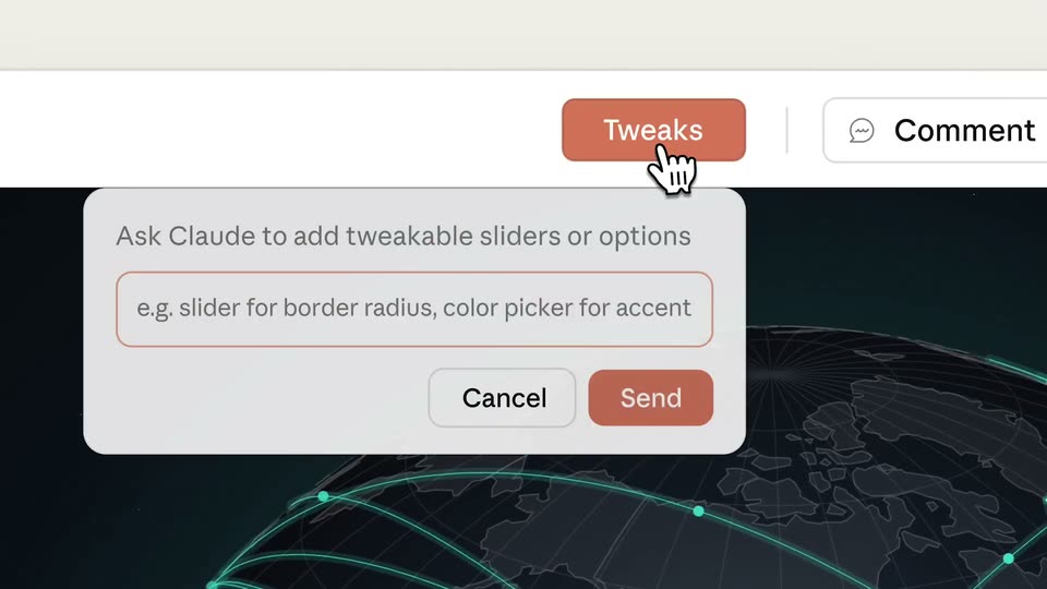
A close-up of the product interface over a dark globe graphic. A hand cursor clicks the orange Tweaks button, a dialog opens, and a prompt is typed into the input field; the cursor clicks Send and the dialog collapses into a small floating text bubble.
Techniques: Cursor demo
Camera: Static
08 · Feature reveal · 0:17–0:19
On a cream screen, a serif “Soldering...” sits beside an orange asterisk that morphs into a spinning ring of dots. A Claude plan panel with a five-item checklist fades in beneath it while the word dissolves.
On-screen text: “Soldering...”
Techniques: Morph
Camera: Static
09 · Feature reveal · 0:19–0:21
A Claude plan panel zooms in on its task list as green checkmarks appear one by one, the current item in dark type and finished items fading to light gray.
Techniques: UI zoom
Camera: Push in
10 · Feature reveal · 0:21–0:24
A dark 3D globe of glowing teal city arcs rotates on the left while a floating control panel on the right scrolls down, revealing theme, breakpoint, network and globe sliders.
On-screen text: “Read current page layout and components”, “Build tweaks state with defaults”, “Create floating tweaks panel UI”, “Add arc and city toggle controls”, “Add breakpoint viewport switcher”
Camera: Pull out
11 · Feature reveal · 0:24–0:25
A close-up of a dark globe with glowing teal city arcs and a settings panel pulls back to reveal the full interface: a left column with the headline and city, route, continent counts, and a right control panel.
Techniques: UI zoom
Camera: Pull out
12 · Feature reveal · 0:25–0:27
A design tool screen pairs a left chat panel with a preview of a dark globe linked by green arcs under the headline Every place has a story. A cursor taps breakpoint pills and drags sliders in a right tweaks panel, reflowing the layout from wide to centered to compact.
Techniques: Cursor demo
Camera: Pull out
13 · Social proof · 0:27–0:29
A dense grid of document windows, each holding a different project (weather app, 3D house, DNA helix, dark globe, proposal table), drifts slowly across the frame as the camera pans.
Camera: Push in
14 · Demo · 0:29–0:34
A design tool workspace with a phone mockup and tweaks panel zooms into a chat card titled “Let’s prototype...”, showing the user’s prompt for a meditation app. The view scrolls down past file chips as Claude’s reply fades in, ending on a bulleted list of the prototype’s features.
Techniques: UI zoom
Camera: Push in
15 · Demo · 0:34–0:34
A cream chat panel scrolls up past file rows and a green checklist, the highlighted Verifier row and the prompt text block shrinking as they move, while a phone mockup of a meditation app stays fixed at the right edge.
Camera: Pull out
16 · Demo · 0:34–0:38
A prototyping tool window shows a phone mockup cycling through a meditation app's home, stats and player screens. The view zooms onto the TWEAKS panel as a cursor taps the Moss swatch, tinting the app green.
Techniques: UI zoom, Cursor demo
Camera: Push in
17 · Feature reveal · 0:38–0:39
A close-up of a toolbar shows a hand cursor pressing the red Comment button, then the view pulls back to reveal a phone mockup beside the TWEAKS panel, where the Moss theme swatch is selected and typography sliders read 100%.
Techniques: Cursor demo, UI zoom
Camera: Pan
18 · Feature reveal · 0:39–0:42
A flat mockup of a phone player beside a TWEAKS panel scrolls down as a cursor types “Add a dark mode toggle” into a comment field and clicks Send, then it cuts to a cream screen with an orange asterisk and the word “Dimming...”.
On-screen text: “Dimming...”
Techniques: Cursor demo
Camera: Pan
19 · Feature reveal · 0:42–0:43
On a plain off-white background, an orange spiky starburst icon sits left of the word Dimming in black serif type, with a black arrow cursor at the right. The word slides in as its middle letters fade through gray.
On-screen text: “Dimming...”
Techniques: Kinetic type, Light sweep
Camera: Static
20 · Feature reveal · 0:43–0:44
A flat phone mockup plays a soundscape beside a TWEAKS card holding a dark mode toggle, theme swatches and size sliders. A hand cursor flips the toggle as the phone screen dims to deep green, while a large serif caption “Dimming...” slides across the center.
On-screen text: “Dimming...”
Techniques: Kinetic type, Cursor demo
Camera: Static
21 · Feature reveal · 0:44–0:46
A hand cursor flips the dark mode toggle on a tweaks panel beside a phone mockup playing Forest Rain. The view then pulls back to reveal the full design-tool workspace, with a chat column on the left and an AI notes panel on the right.
Techniques: Cursor demo, UI zoom
Camera: Pull out
22 · Social proof · 0:46–0:47
A dense grid of product interface windows fills the frame. The camera quickly glides across the collage, passing chat, design, code, and presentation screens, a dark music player window sits at the center before the view shifts.
Camera: Push in
23 · Feature reveal · 0:47–0:49
A wide view of a document editor zooms into the top toolbar, where a hand cursor rises and taps the coral Comment button.
Techniques: UI zoom, Cursor demo
Camera: Push in
24 · Feature reveal · 0:49–0:50
A retreat-planning interface shows a card with a forest photo and a comment box. The field types out a note while a hand cursor moves to the Send button.
Techniques: Cursor demo
Camera: Static
25 · Feature reveal · 0:50–0:52
A comment card over a retreat slide shows a cursor over Send; the card exits, the view reframes closer to the slide, and the forest photo swaps to a coastline photo.
Techniques: Cursor demo, UI zoom
Camera: Push in
26 · Feature reveal · 0:52–0:53
A horizontal row of rounded pill buttons, labeled Edit text, Knobs and Draw, slides left across a cream background. A black arrow cursor holds its position, then becomes a pointing hand that taps the Knobs pill, which fills orange.
Techniques: Cursor demo
Camera: Static
27 · Feature reveal · 0:53–0:56
A flat product screen shows a Hemlark Retreat offsite page beside a Knobs typography panel; a cursor moves over the Size and Line fields. It cuts to a row of three white chips, Edit text, Knobs, and Draw, sliding in on a pale gray background.
Techniques: Cursor demo
Camera: Static
28 · Feature reveal · 0:56–0:57
A row of three white rounded buttons labeled Comment, Edit text, and Knobs sits on a cream background. A black hand cursor hovers over the Edit text button, which fills with salmon pink.
Techniques: Cursor demo
Camera: Static
29 · Feature reveal · 0:57–0:58
A design editor fills the frame: a beach document sits between an AI chat panel on the left and a content outline on the right. The toolbar labels Comment, Edit text and Knobs slide in from the side as the document headline Hemlark Retreat '26 scales up.
Camera: Pull out
30 · Social proof · 0:58–0:59
The camera pulls back from a central document window showing a Hemlark Retreat '26 travel brochure with a coastal cliff photo. The zoom reveals a grid of overlapping app windows, each a different document, filling the frame.
Techniques: 3D mockup, UI zoom
Camera: Pull out
31 · Feature reveal · 0:59–0:59
A grid of blurred product screens frames a sharp central window. Its traction panel counts up to 3,200+ with a 4.9 rating, then a comment dialog with Discard, Queue and Send buttons pops up over it.
Camera: Push in
32 · Feature reveal · 0:59–1:01
A light product interface shows a chat sidebar beside a slide canvas holding a large stat and a bar chart. A comment dialog types out a request while a mouse cursor rests on the Send button.
Techniques: Cursor demo
Camera: Push in
33 · Feature reveal · 1:01–1:02
A white comment card sits on a muted blue-gray background, holding a bold heading, a red-outlined text field reading “Make this a line graph instead?”, and three buttons. A hand-drawn cursor rests on the salmon Send button as the card drifts slightly upward.
Techniques: Cursor demo
Camera: Push in
34 · Feature reveal · 1:02–1:05
A presentation editor shows a slide with a traction stat and a bar chart that morphs into a line chart. The view reframes to the top toolbar, where a cursor clicks Export and hovers the PPTX option in the dropdown menu.
Techniques: UI zoom, Morph, Cursor demo
Camera: Push in
35 · Feature reveal · 1:05–1:06
An export dropdown menu stays open over a Hemlark Retreat '26 page while a hand cursor moves down the options. The desktop layout then reshapes into a mobile phone view, the menu still floating above it.
Techniques: Cursor demo, Morph
Camera: Static
36 · Feature reveal · 1:06–1:08
A product interface fills the frame as a white cursor hovers the open export dropdown, highlighting Export as standalone HTML while the list scrolls. On the left, a phone mockup cuts from a music player to a 3D globe with green arcs. The camera pans and zooms across the panel.
Techniques: Cursor demo, UI zoom
Camera: Pan
37 · Feature reveal · 1:08–1:09
A browser window shows a dark globe with teal connection lines on the left. An open export dropdown on the right lists options; a hand cursor hovers down the list from standalone HTML to Claude Code while the menu items glide with a motion-blur trail.
Techniques: Cursor demo
Camera: Pull out
38 · Feature reveal · 1:09–1:10
A chat panel sits beside a dark landing page; a send-to-agent modal with a code prompt and copy button covers the view, a cursor hovers the button, then the modal clears to reveal the rotating green globe and city stats.
Techniques: Cursor demo
Camera: Pull out
39 · Social proof · 1:10–1:13
The camera pulls back across a grid of product interface windows on a cream backdrop, widening from a few rows to the full wall of panes, each showing chats, articles, 3D scenes and charts.
Camera: Pull out
40 · Outro · 1:13–1:13
A grid of browser mockups on a cream background fades out, leaving a centered outline palette icon and the word Design. The label shifts from gray to black as the screens clear away.
On-screen text: “Design”
Camera: Static
41 · Outro · 1:13–1:16
A centered logo lockup sits on a cream background: a black-outlined paint palette icon next to the wordmark Design, with by Anthropic Labs below. The lower line fades in, and a small pink dot pulses at the end of the wordmark before settling.
On-screen text: “Design”, “by Anthropic Labs”
Camera: Static
42 · Outro · 1:16–1:21
On a cream background, the coral asterisk logo mark sits left of the black serif wordmark, centered in frame. The asterisk rotates slowly while the wordmark holds still.
On-screen text: “Claude”
Camera: Static