0:40

Topograph | The data layer for KYB
Topograph · Nov 2026
Twenty · Nov 2026 · 0:18 · AI-annotated
Twenty’s 0:18 launch film runs 13 scenes, about 1.4 s each. The product is on screen from the first frame and 3 features are revealed. The call to action lands at 0:15 (82% in). The video is built as a single continuous motion piece with no hard cuts, where a serif headline swaps in place over a shrinking or sliding interface mockup, alternating between a light Figma canvas and a dark app screen. Its signature moves are the headline swap that re-frames the same UI, the drift of scattered tags into aligned slots, and the terminal command typed at the end, all set to a calm, precise 99 bpm pace with a restrained gray, black, and blue palette.
Is this your launch? to your site or press kit.
Topograph · Nov 2026
Latent · B2B · Oct 2026
A CRM interface window fades in and drops into place beneath a serif headline. The headline glides from the top right to center, darkening as 'UI.' appears. The window shows a Companies list with names and URLs.
On-screen text: “Twenty UI.”
Techniques: Kinetic type
Camera: Pull out
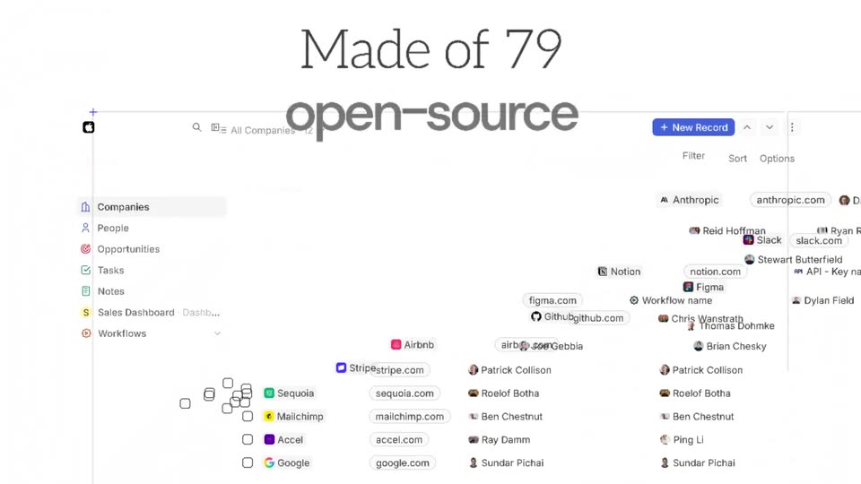
A CRM interface mockup sits on a white design canvas with blue selection handles. The title Twenty UI. fades out as large mixed serif and sans text, Made of 79 open-source components, fades in over the shrinking mockup.
On-screen text: “Twenty UI.”, “Made of 79 open-source components.”
Techniques: Kinetic type
Camera: Pull out
A white card, tilted slightly and marked with selection handles, carries the headline while a grid of UI component cards (buttons, chips, avatars, checkboxes) sits behind it on a white canvas. The layers drift slowly at different speeds.
On-screen text: “Made of 79 open-source components.”
Techniques: Parallax
Camera: Pull out
A tiled grid of UI component cards slowly zooms in while a large dark headline holds centered. The headline then blurs out as a faint repeated watermark of the same text fades in across the frame and the grid softens.
On-screen text: “Made of 79 open-source components.”
Techniques: Parallax
Camera: Push in
A dark screen brightens as the serif line 'Building a Twenty app?' holds top left and a bold sans line 'Use the same parts.' slides in beneath it. The Twenty interface for the Anthropic record fades up below, showing a detail panel and a call recordings timeline.
On-screen text: “Building a Twenty app?”, “Use the same parts.”
Techniques: Kinetic type
Camera: Static
A dark CRM record screen for Anthropic sits below a two-line headline that swaps from one phrase to another. As the headline changes, red Recording and orange Processing tags drift from a scattered cluster into aligned slots beside the call-recording rows.
On-screen text: “Building a Twenty app?”, “Use the same parts.”, “Your widget, on every record.”
Techniques: Kinetic type
Camera: Static
A dark CRM interface shows the Anthropic record with a timeline, then a settings panel slides in from the right as the headline swaps from one phrase to the next.
On-screen text: “Your widget, on every record.”, “Your settings, inside Settings.”
Techniques: Kinetic type, UI zoom
Camera: Pan
A dark settings panel for the Call recorder app sits beneath a white headline. A left sidebar fades out and the AI summaries toggle flips on.
On-screen text: “Your settings, inside Settings.”
Camera: Pan
A dark product UI pairs a settings list with a Create Linear issue side panel. The headline swaps “Your settings,” for “Your form,” as the title field fills. The dark UI then slides left, revealing a white layout of stacked interface mockups while the side panel holds on the right.
On-screen text: “Your settings, in the side panel.”, “Your form, in the side panel.”
Techniques: Kinetic type
Camera: Pan
A light backdrop holds a grid of product interface screenshots under the headline “Open-source Figma too.”; colored name chips in green, blue and red point to panels, then the view zooms into the central “Companies layout edition” screen.
On-screen text: “Open-source Figma too.”, “charlesBochet”, “Weiko”, “Bonapara”
Techniques: UI zoom
Camera: Push in
A white CRM record page fills the frame, with a left fields panel, a central widget list, and a right field menu. A cursor hovers over an item at the bottom right, triggering a small label. A headline reads above the interface.
On-screen text: “Open-source Figma too.”
Techniques: Cursor demo
Camera: Static
A faint CRM screen fades to a pale gray field as the black Twenty logo and tagline hold center. Thin horizontal lines animate into a rounded oval with a curved arrow behind the text. The frame is locked off and the pace is slow.
On-screen text: “Twenty UI.”, “Now yours.”
Camera: Static
A black 20 logo sits above two lines of type, “Twenty UI.” in serif and “Now yours.” in bold sans, on a light gray field with a hatched oval behind. A terminal box below types out the command “yarn add twenty-ui” with a blinking cursor.
On-screen text: “Twenty UI.”, “Now yours.”, “yarn add twenty-ui”
Camera: Static