2:35
Pratap Ranade - Today, we’re excited to unveil Heaviside-1, @arenaphysica's second ge
Arena Physica · Sep 2026
Netlify · Jun 2023 · 1:14 · AI-annotated
Netlify’s 1:14 launch film runs 20 scenes, about 3.7 s each. The product shows up at 0:09 and 3 features are revealed. The call to action lands at 1:08 (92% in), over a voiceover. The video alternates abstract UI wireframe collages with labeled architecture diagrams, each feature announced by a white pill and demoed with dotted flow lines on a dark navy field. Signature moves are draw-in line art, radial-blur wipes, and a recurring tile grid that assembles from scattered icons and disassembles to pass between features.
Is this your launch? to your site or press kit.
Arena Physica · Sep 2026
Iron Grid · Industrials · Sep 2025
Enrich Labs · Nov 2026
A wireframe browser bar, crossed image boxes, pie charts, gradient circles, a grid and search bars draw in and scale up on a dark navy field, then the view zooms through the floating collage of abstract UI shapes.
Camera: Pan
Line-art UI wireframes and gradient circles drift and rotate across a dark navy field, then clear the frame. A tilted cluster of cards, search bars and app icons assembles beneath a white browser bar, then the frame cuts to a centered 3x3 grid of white geometric icons.
Camera: Pan
A 3x3 grid of white geometric icons sits centered on dark navy. The icons gain blue-green gradient fills and lock into outlined tiles under a white bar as Netlify Connect fades in above, then the mark scales down to a small centered logo.
On-screen text: “Netlify Connect”
Techniques: Morph
Camera: Static
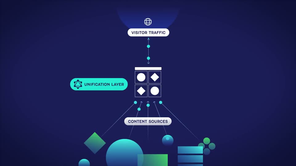
A diagram assembles on a dark blue field: a 2x2 grid icon with a teal UNIFICATION LAYER pill, a CONTENT SOURCES pill below, and a VISITOR TRAFFIC pill with a globe on top. Dotted lines carry small moving dots between the abstract shapes below and the grid.
On-screen text: “UNIFICATION LAYER”, “CONTENT SOURCES”, “VISITOR TRAFFIC”
Techniques: Particles
Camera: Static
A dark blue infographic stacks a globe, a four-tile grid, and 3D spheres and cubes, tied by dotted lines and pill labels (Visitor Traffic, Unification Layer, Content Sources). The view scales up, then flares into radial blur.
Techniques: Speed ramp
Camera: Pull out
Blue and teal geometric shapes, a wireframe cube and gradient discs, settle on the left of a dark navy field as a 3x3 grid of white icons forms on the right. A cursor glides across the grid, then the grid slides toward center while the left shapes drift out.
On-screen text: “0”
Techniques: Cursor demo
Camera: Pull out
A 3x3 grid of thin outlined tiles, each holding a small blue or green geometric shape, sits beneath a solid white bar on a dark blue gradient. The whole assembly drifts downward and softens into motion blur as it falls.
Camera: Static
Abstract icons, a blue circle, stacked bars, a green dot cluster and a teal diamond, float on a dark blue field, then align into a vertical list as a browser window frame draws in, with placeholder lines at left and a cursor at right.
Camera: Static
A blue Data Sources panel in 3D perspective sits center frame, listing WordPress, Shopify, Contentful and Drupal, with a cursor on the Add a Data Source button. The camera pulls back to reveal an activity list and a second sources panel flanking it.
Techniques: 3D mockup
Camera: Pull out
A blue interface mockup shows a My Data Layer window with an Activity panel of sync rows marked In progress and Complete. A page card on the left holds a Publish button linked by a dotted line, the cursor moves to it, and the view zooms in.
Techniques: Cursor demo, UI zoom
Camera: Push in
A flat blue interface shows a My Data Layer window with an Activity card listing a Contentful sync as in progress and four completed rows. A left sidebar slides in with chevron rows while a dashed connector line and cyan dot point toward the card.
Camera: Pan
Flat vector web elements, browser windows, buttons, icons, charts and envelopes, drift in on a dark blue field, then settle into a hub-and-spoke diagram with dotted lines radiating from a central grid of circles and diamonds. A cursor taps icons in the right-side grid as the layout pulls back.
On-screen text: “Sign Up Today”, “Spring Sale”, “Add to Cart”, “Rebajas de primavera”
Techniques: Cursor demo
Camera: Pull out
A flat diagram on dark navy: a 2x2 grid icon labeled NETLIFY HIGH-PERFORMANCE EDGE sits center, dotted lines fan down to abstract spheres and shapes labeled CONTENT SOURCES, and a globe labeled VISITOR TRAFFIC drops in above. Small dots travel the lines to show flow.
On-screen text: “NETLIFY HIGH-PERFORMANCE EDGE”, “CONTENT SOURCES”, “VISITOR TRAFFIC”
Techniques: Particles
Camera: Static
A vertical network diagram on a dark blue field shows a globe labeled Visitor Traffic above a 2x2 grid labeled Netlify High-Performance Edge, with dotted lines and moving cyan dots linking down to abstract shapes for Content Sources. The camera pushes in to reframe on the tilted grid.
On-screen text: “VISITOR TRAFFIC”, “NETLIFY HIGH-PERFORMANCE EDGE”, “CONTENT SOURCES”
Camera: Static
A flat blue globe with dotted connection arcs and small teal dots traveling along the lines fills the top. Below, a white banner labeled “Netlify High-Performance Edge” sits above a grid of six tiles holding abstract shapes: blue circles, green diamonds, blue bars and a cluster of green dots. The graphic slowly zooms in.
On-screen text: “Netlify High-Performance Edge”
Camera: Static
A flat diagram on dark blue shows gradient shapes feeding a grid icon labeled CONTENT SOURCES via dashed arrows. The view pans up to add a globe labeled VISITOR TRAFFIC with cyan dots flowing down, then a cyan caption DATA CACHED IN NETLIFY CDN slides in at left.
On-screen text: “CONTENT SOURCES”, “VISITOR TRAFFIC”, “DATA CACHED IN NETLIFY CDN”
Camera: Static
A dark blue gradient holds a white grid icon, a bar over a 2x2 set of circles and diamonds, with a CONTENT SOURCES pill and dashed arrows below. The icon slides right as those clear and a CONNECT EVERYTHING pill scales in to its left, linked by a dashed line.
On-screen text: “CONTENT SOURCES”, “CONNECT EVERYTHING”
Camera: Static
A window icon sits center on dark navy, dotted lines linking it to a CONNECT EVERYTHING pill. App icons and shapes slide in from the left, then a line-art phone, card, and browser window wipe in from the right with a BUILD ANYTHING pill. The left cluster blurs and exits.
On-screen text: “CONNECT EVERYTHING”, “BUILD ANYTHING”
Techniques: Masking, Kinetic type
Camera: Static
Dark navy field: white pill badges “CONNECT EVERYTHING” and “BUILD ANYTHING” flank a gray “Netlify Connect” title on dotted lines; the badges scale away as the title slides up, grows and turns white above a 2x2 grid icon and a teal “Request Demo” button.
On-screen text: “CONNECT EVERYTHING”, “Netlify Connect”, “BUILD ANYTHING”, “Request Demo”
Techniques: Kinetic type
Camera: Static
A dark navy field holds a centered white title and a teal pill button. The title slides in with a brief color-split offset, then a white cursor glides to the button and hovers, scaling it up slightly, before leaving the frame.
On-screen text: “Netlify Connect”
Techniques: Kinetic type, Cursor demo
Camera: Static