0:35


Viral SaaS Product Launch Video Idea | Commas Webinar
Commas · Sep 2026
MCPJam · Sep 2026 · 2:39 · AI-annotated
MCPJam’s 2:39 launch film runs 55 scenes, about 2.9 s each. The product shows up at 0:25 and 4 features are revealed. The call to action lands at 2:21 (89% in), over a voiceover. The video cuts between a talking-head presenter in a bright room and cream grid-paper diagrams plus clean product UI mockups, walking through four numbered features marked by a protractor dial. Steady ~108 bpm pacing with short cuts, using slide-in cards, red arrows and coral accents as the signature moves.
Is this your launch? to your site or press kit.
Commas · Sep 2026
Visually · Oct 2026
Opal · Oct 2026
A man in a black t-shirt sits at a wooden table in a bright living room, speaking to the camera and gesturing with both hands. A white caption appears at the bottom of the frame near the end. The shot is locked off.
On-screen text: “We need to talk about it.”
Camera: Static
A man in a black t-shirt sits centered in a bright living room, speaking to the camera and raising his hands into fists. A white caption sits across the lower frame. The shot is locked off, medium framing, with a sofa, plant and guitar in the background.
On-screen text: “We need to talk about it.”
Camera: Static
A diagram on cream builds a flow: a Users card connects by line and arrow to a Your product card, with find between them. Find slides up and fades as interact slides into the center, then a new panel slides in from the left.
On-screen text: “FUNDAMENTALLY RESHAPING”, “Users”, “find”, “Your product”, “interact”
Techniques: Kinetic type
Camera: Static
A man in a black t-shirt sits at a wooden table in a bright living room, speaking to the camera and gesturing with his hands. A locked-off shot holds him centered while caption text slides in around him.
On-screen text: “FUNDAMENTALLY RESHAPING”, “Users”, “find”, “Your product”, “interact”
Camera: Static
A diagram on cream grid paper: a red arrow draws from a User card to an AI CLIENT box while ChatGPT and Claude logos fade in inside it, then the frame pans right to reveal a Your MCP server box joined by a second red arrow.
On-screen text: “Users start with ChatGPT or Claude”, “8”
Camera: Pan
A headline sits above a flow diagram of labeled cards and red arrows on a grid background. The view starts zoomed on the AI client and MCP server, then pulls back to reveal the full chain from User to Your product, with the app window tagged NOT OPENED below.
On-screen text: “They reach your product through your MCP server”, “User”, “AI CLIENT”, “ChatGPT”, “Claude”, “Your MCP server”, “Your product”, “Your app”, “NOT OPENED”
Camera: Pull out
A flowchart on a cream grid background links User, AI client (ChatGPT, Claude), MCP server and product boxes with red arrows. A dotted line draws down to a greyed-out app window tagged NOT OPENED, and a strikethrough briefly crosses the User label before clearing.
On-screen text: “Your users aren't in your app anymore”
Camera: Static
A cream slide shows a flow diagram of AI clients routing through your MCP server to your product, above a 'Your app' window tagged NOT OPENED, under the headline 'Users aren't in your app anymore.' It cuts to a presenter in a black tee gesturing at a desk.
On-screen text: “Users aren't in your app anymore”
Camera: Static
A flowchart assembles on a dotted grid: User, Agent, and MCP server cards link left to right as dashed question labels pop in. A red X then blocks the output arrow and bold text declares most MCP servers fail in production, before cutting to a presenter at a desk.
On-screen text: “User”, “What are users asking?”, “Agent”, “How is the agent reasoning?”, “Your MCP server”, “Value for the user”, “Did the server deliver value?”, “Most MCP servers fail in production.”
Techniques: Kinetic type
Camera: Pull out
A man in a dark t-shirt sits on a couch in a bright living room, speaking to the camera and gesturing. A white name card with corner brackets appears on the right, linked by a thin line to a dot, showing his name and titles, then fades out.
On-screen text: “Prathmesh Patel”, “CEO, MCPJam”, “ex-Asana · MCP & API Technical Lead”
Camera: Static
A man in a dark t-shirt sits at a wooden table in a bright living room, speaking to camera with open-hand gestures. A white sofa, potted plant, guitar and floor lamp fill the background. A lower-third name caption stays locked on screen.
On-screen text: “Prathmesh Patel”, “CEO, MCPJam”, “ex-Asana · MCP & API Technical Lead”
Camera: Static
A man in a black t-shirt with a clip-on microphone sits in a sunlit living room, facing the camera and gesturing with both hands as he speaks. Behind him a white sofa, an acoustic guitar, a leafy plant and a vase of pink flowers fill the frame.
Camera: Static
A man in a black t-shirt sits at a wooden table in a bright living room, then lifts a laptop toward the camera and holds it steady, its screen showing a light web interface in the lower half of the frame.
Camera: Push in
The wordmark “MCP Jam” sits centered over a blurred browser window, then the background clears to a plain cream field as the logo comes into sharp focus.
On-screen text: “MCP Jam”
Camera: Push in
On a cream field, the MCPJam logo (black and coral) sits above a thin rule and a tagline that darkens from gray to black. Below, three stats, 106,000+ developers, 300+ enterprises, and 2.2k+ GitHub stars with a GitHub mark, fade in from left to right.
On-screen text: “First testing and evaluation platform for MCP servers”, “106,000+ developers”, “300+ enterprises”, “2.2k+ GitHub stars”
Camera: Static
A cream card holds the MCPJam wordmark, a one-line tagline, and three stat figures with small captions. A black panel wipes in from the left edge, and a light letter-spaced heading CLIENT COVERAGE fades in on the right.
On-screen text: “MCPJam”, “First testing and evaluation platform for MCP servers”, “106,000+”, “developers”, “300+”, “enterprises”, “2.2k+”, “GitHub stars”, “CLIENT COVERAGE”
Techniques: Masking
Camera: Static
Left black panel: a list of client cards (ChatGPT, Claude, Gemini, Cursor, Copilot) scrolls up as statuses flip from spinning UPDATING to green UPDATED. Right cream panel: a CLIENT COVERAGE label, a bold headline revealed by a top mask, and a +16 clients tracked stat pop in.
On-screen text: “CLIENT COVERAGE”, “We keep up with every major AI client.”, “+16”, “clients tracked”
Techniques: Masking, Kinetic type
Camera: Static
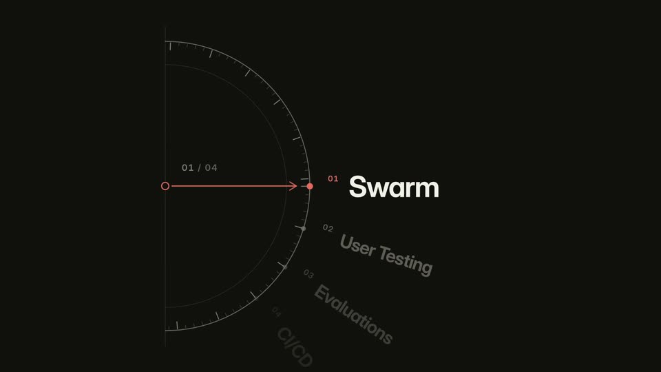
A black frame holds a thin semicircular gauge with a red needle pointing right. A diagonal list fades in: “01 Swarm” in white scales up at the top while “02 User Testing”, “03 Evaluations” and “04 CI/CD” stay dimmed below.
On-screen text: “01 / 04”, “01”, “Swarm”, “02”, “User Testing”, “03”, “Evaluations”, “04”, “CI/CD”
Techniques: Kinetic type
Camera: Static
A darkened persona-creation form sits behind a large white Swarm title that scales up, with rotated User Testing and Evaluations labels and a thin ring. A pink dot travels along a line from 01 to 02, then the overlay fades to reveal the bright form.
On-screen text: “01”, “Swarm”, “02”, “User Testing”, “Evaluations”
Techniques: Kinetic type
Camera: Static
A light interface lists three robot persona cards beneath the headline. A cursor travels down the list and clicks the third card's Remove button, unfolding it into an edit form with name, role and use-case fields.
On-screen text: “SWARMS”, “Agent personas act as your users”
Techniques: Cursor demo
Camera: Static
A light-background product UI displays a persona form card with name, role and goals fields. The card dissolves from one persona profile to another, then the goals list scrolls upward. A bold black headline sits above the card.
On-screen text: “Agent personas act as your users”
Camera: Pan
A dashboard UI runs beneath the headline “Agent personas prompt across every client.” Session rows flip from Running to green completed as the progress bar advances; a chat panel types user and agent messages while a cursor moves. It cuts to a findings summary with persona cards and satisfied goals.
On-screen text: “Agent personas prompt across every client”
Techniques: Cursor demo
Camera: Static
A dark scrim over a findings dashboard lifts to reveal the interface in full color, showing a persona row and a goals list with status tags. The bold headline and a small SWARMS pill sit above the panel on a white background.
On-screen text: “SWARMS”, “Findings show where goals stalled”
Camera: Static
A dark user-value-chain panel scales up from the bottom of a light findings dashboard to fill the frame, revealing a failed goal row and session notes. A cursor hovers over the panel.
On-screen text: “Findings show where goals stalled”
Techniques: UI zoom
Camera: Push in
A dark diagnostic dashboard shows a six-stage user value chain; a cursor clicks the red User value card and the detail panel below expands with two failed session quotes. A User value failed callout appears top right under the headline, then the whole panel fades to white.
On-screen text: “Swarm·Sep 16”, “Findings show where goals stalled”, “User value failed”
Techniques: Cursor demo
Camera: Static
A light dashboard card holds a Sankey flow diagram linking goal, behavior, outcome and sentiment nodes; the view zooms in and pans left to right while a cursor hovers over the colored flows.
On-screen text: “Every session, from goal to outcome”
Techniques: Cursor demo, UI zoom
Camera: Push in
A white analytics card holds a Sankey flow diagram with blue, orange and purple bands linking left-side goals to right-side outcomes. The bands ease into their final positions while a cursor hovers over the middle flow. A dark bold headline and a small SWARMS badge sit above the card.
On-screen text: “SWARMS”, “Every session, from goal to outcome”
Techniques: Cursor demo
Camera: Static
A gray field holds a curved white arc with tick marks. A thin pink arrow draws from a small circle to a dot on the arc, under a 01 / 04 counter. Along the curve, labels 01 Swarm, 02 User Testing and 03 Evaluations fade in, the first in bold white.
On-screen text: “01 / 04”, “01 Swarm”, “02 User Testing”, “03 Evaluations”
Camera: Static
A semicircular gauge with tick marks and a red pointer sits left of a curved list of four labels. The active label, Swarm, User Testing, Evaluations or CI/CD, scales up to white bold as the counter steps 01 to 04 and loops, the red marker sliding down the arc.
On-screen text: “01 / 04”, “01 Swarm”, “02 User Testing”, “03 Evaluations”, “04 CI/CD”
Techniques: Kinetic type
Camera: Static
A dimmed product screen shows a white dialog titled 'What should they try?' while a blinking caret types two task sentences into numbered input fields. A bold black headline and a small 'USER TESTING' pill sit above the interface.
On-screen text: “USER TESTING”, “Write the tasks testers should try”
Camera: Static
A product card on a white background shows a user testing form with two task fields and a red Create study button, a cursor resting on it. The card then switches to a follow-up screen with a prompt field, a generated link and a Copy link button.
On-screen text: “USER TESTING”, “Write the tasks testers should try”, “app.mcpjam.com/user-testing/chatgpt/bNc0vTHDA7OnIZLm...”
Techniques: Cursor demo
Camera: Static
A cream product UI card holds an input field with a blinking caret and a red send button, plus a URL field and a red Copy link button. A hand cursor rests on that button while the top headline sharpens out of blur.
On-screen text: “Copy the study link”
Techniques: Cursor demo
Camera: Static
A chat client card on cream shows a thread ending in a message with a share link; a text cursor blinks in the empty message field. Above, the heading 'Send it to your testers' and a USER TESTING pill sit. The card then clears to blank white.
On-screen text: “USER TESTING”, “Send it to your testers”
Camera: Static
A white product window sits on a cream background beneath a bold black headline and a small USER TESTING badge. A cursor glides to the What to try button in the top bar and clicks it, opening a dropdown panel with two unchecked checklist items.
On-screen text: “USER TESTING”, “A tester opens the link”
Techniques: Cursor demo
Camera: Static
A white interface card on a cream background sits under a headline that swaps from “A tester opens the link” to “They try it in a real conversation”. An Amazon AirPods result fades in inside the card, then dims as function labels appear below it.
On-screen text: “USER TESTING”, “A tester opens the link”, “They try it in a real conversation”
Camera: Static
A chat card shows a user message and an embedded Amazon product card. A cursor clicks the yellow Add to cart button, which flips to a green Added to cart state with a dark tooltip, then the panel scrolls down to reveal the assistant reply and a five-star rating.
On-screen text: “USER TESTING”, “They try it in a real conversation”
Techniques: Cursor demo
Camera: Static
A darkened AI chat screen over an Amazon listing fills the frame, a white rating card with five gold stars and a typed input field centered on it. A USER TESTING pill and the headline They rate each response anchor the top left as the input text changes.
On-screen text: “USER TESTING”, “They rate each response”
Camera: Static
A white chat panel sits on a cream background while the conversation scrolls and a user types short commands into the input field. A bold caption above the panel cycles through three lines, and a cursor rests near the rating stars.
On-screen text: “USER TESTING”, “Not every turn goes well”, “But it gets even worse”, “The user knew something was wrong”
Techniques: Cursor demo
Camera: Pull out
A chat interface card sits on a cream background under the headline. A cursor moves in to hover over the Send button, then a white callout label slides in from the left, bracketed to the feedback input field at the bottom of the card.
On-screen text: “USER TESTING”, “You hear exactly what went wrong”, “The tester's own words”
Techniques: Cursor demo
Camera: Static
A flat product dashboard shows a session detail with metrics and a tester rating. A cursor hovers the rating, and a right-side callout card labels it. The view then zooms to the action buttons as the callout switches to the promote button.
On-screen text: “PROMOTE TO EVALS”, “Session”, “Rated ★★ by a tester”, “2 of 5 stars”, “Promote to test case”
Techniques: Cursor demo, UI zoom
Camera: Push in
A flat product screen shows a 'Promote to test case' modal over a dimmed session list. A right-side callout strikes through 'Session' and types 'Reusable case' and 'Search the Amazon catalog'. The UI fades as a circular four-step dial draws in, highlighting 'User Testing' at 02 / 04.
On-screen text: “PROMOTE TO EVALS”, “Session”, “Promote to test case”, “Reusable case”, “Search the Amazon catalog”, “02 / 04”, “Swarm”, “User Testing”, “Evaluations”, “CI/CD”
Techniques: Kinetic type
Camera: Pull out
A black gauge dial with a red pointer advances from step 02 to 03, its arced labels (Swarm, User Testing, Evaluations, CI/CD) shifting as the active one enlarges, then a light eval-suite form screen fills the frame with filled fields and a model table.
On-screen text: “02 / 04”, “Swarm”, “User Testing”, “Evaluations”, “CI/CD”
Camera: Static
A cream-toned form titled Create a new eval suite scrolls down to reveal client and model rows. A cursor glides in from the right and presses the red Continue button at the lower right.
On-screen text: “EVALS”, “Create an eval suite”
Techniques: Cursor demo
Camera: Static
A light product screen shows a “Create an eval suite” panel with three option cards (Describe, Generate, Import) and a “Suite created” toast in the lower right corner. A cursor drifts slightly near the toast.
Techniques: Cursor demo
Camera: Static
A dimmed product screen holds a white modal dialog with radio options and a red Generate button. A hand cursor moves from the Read and write option down to the button. At the top left a black headline fades in beside a small EVALS pill.
On-screen text: “EVALS”, “Automatically generate test cases”
Techniques: Cursor demo
Camera: Static
A light product panel lists draft test cases beneath the headline 'Automatically generate test cases'. The list scrolls up as a cursor glides to the red 'Add all to suite' button and clicks it, and the panel clears to a short reviewed-state message with a back link.
On-screen text: “EVALS”, “Automatically generate test cases”
Techniques: Cursor demo
Camera: Static
A close-up of a test case editor shows prompt and expected outcome fields, the heading fading in as a bracketed label reading A repeatable test pops in beside it. The view then zooms out to the full suite list as a cursor hovers the Setup Prompt button.
On-screen text: “Each case: a prompt and an expected outcome”, “A repeatable test”
Techniques: UI zoom, Cursor demo
Camera: Static
A cream screen shows the heading “Run the suite across clients and models” above a product panel of test cases and model combos. A hand cursor scrolls to the Start run button and clicks it; the button turns salmon with a checkmark while the case list dims to gray.
On-screen text: “EVALS”, “Run the suite across clients and models”
Techniques: UI zoom, Cursor demo
Camera: Push in
A light results dashboard crossfades in over a run-starting panel, showing three AI clients with pass rates. A bracketed callout tags them side by side, the view scrolls to a test-case table of colored bars, and a cursor moves across the rows.
On-screen text: “Run the suite across clients and models”, “Results, client by client”, “Every client, side by side”, “Open any weak case”
Techniques: Cursor demo
Camera: Pull out
A tilted 3D mockup of an evals dashboard shows a test-case list and a results table, with a cursor over the rows. A white caption 'Every iteration, passed or failed' pops in below. The panel then dissolves into a circular 'Evaluations 03 / 04' section marker on white.
On-screen text: “EVALS”, “Open any weak case”, “Every iteration, passed or failed”, “Evaluations”, “03 / 04”
Techniques: 3D mockup, Cursor demo
Camera: Static
A dark protractor-style dial with a red pointer sits left, the counter reading 04 / 04. The large white label switches from Evaluations to CI/CD while dimmed step names Swarm, User Testing and Evaluations arc above the dial.
On-screen text: “CI/CD”
Techniques: Kinetic type
Camera: Static
A CI/CD loop draws on a cream dotted grid, joining Change, Pull request, GATE and Merge cards into a circle. A bold 'Continuous gating' headline fades in at the center. The GATE badge flips between a green check and a red X as a 'Fix' line returns to Change.
On-screen text: “Continuous gating”, “Every pull request · On every commit”
Camera: Static
A flat diagram builds on cream: a server card links by arrows to an MCPJam checklist, whose rows fill with green Pass and orange 3 issues pills. Branches lead to Ready to Ship and Changes suggested pills, and a Triage Insights note loops back to the server.
On-screen text: “RELEASE CHECKS”
Camera: Static
A man in a brown jacket sits in a chair by a window and whiteboard, gesturing as he talks to camera. On the left, white boxes for the MCP server and users build up, then a red-and-white MCPJam lower-third cycles taglines and client icons, ending on the URL.
On-screen text: “Your MCP server”, “value”, “Your users”, “MCPJam”, “The testing platform”, “See how your server behaves”, “Ship reliable experiences to your users”, “Across every AI client”, “Start testing today”, “mcpjam.com”
Camera: Static
On black, a white mcpjam.com sits low left while “Start testing today” slides in, then the two-tone MCPJam wordmark, white MCP and coral Jam, scales up at center with a smaller mcpjam.com beneath it.
On-screen text: “mcpjam.com”, “Start testing today”, “mcpjam.com”
Techniques: Kinetic type
Camera: Static