0:50
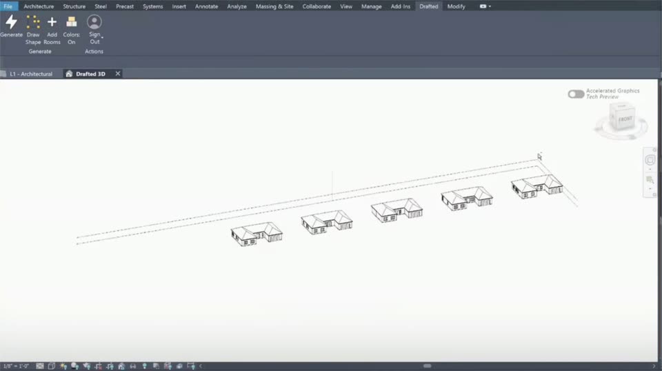

Drafted - Introducing Drafted in Revit. Draw a footprint, add your room list,
Drafted · Consumer · Sep 2026
Graphical · Oct 2026 · 0:38 · AI-annotated
Graphical’s 0:38 launch film runs 7 scenes, about 5.6 s each. The product shows up at 0:02 and 1 feature is revealed. The call to action lands at 0:23 (61% in). The video is built as a sequence of static card grids that fade and slide into place, a live theming demo that recolors every card, a zoomed-in edit of one slider component, and a closing title card with an orbiting icon ring. Pacing is slow and deliberate, with fades, panel slides, a live color cycle and a steady orbit as its signature moves.
Is this your launch? to your site or press kit.
Drafted · Consumer · Sep 2026
Aside · Consumer · Nov 2026
A 2x3 grid of rounded UI cards fades in from low opacity on a pale gray field, settling into a static layout; the top-left card keeps a green border while the others show a palette, a plan list, a type specimen, a join toast and a post.
Camera: Static
A 2x3 grid of cream UI cards settles into place on a light background. The line chart in the bottom-middle card draws upward and fills, while the dark purple brief card, color palette, checklist, type specimen and date card slide into alignment.
Camera: Static
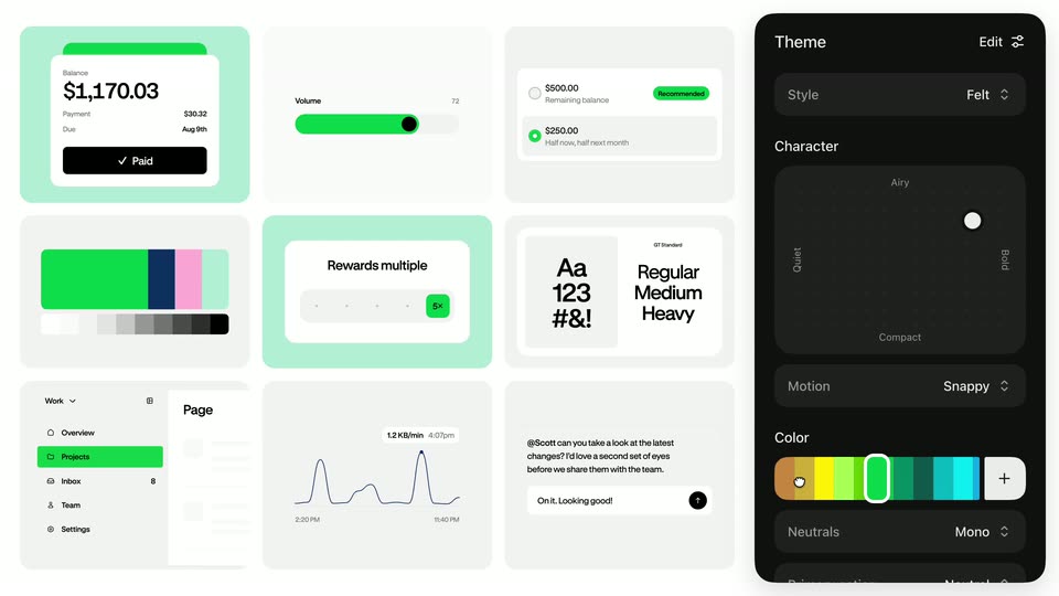
A grid of light UI component cards fills the left while a dark Theme panel slides in from the right. Moving the color swatch cycles the accent color across all cards from red to orange to green, and the character dot drifts within the panel.
Techniques: Cursor demo
Camera: Pull out
A design tool canvas zooms from a component grid to a single green volume slider. A cursor selects the track, thumb, label and value in turn; the dark properties panel on the right updates, swapping the thumb to white and resizing the text live.
Techniques: UI zoom, Cursor demo
Camera: Static
A design tool workspace shows three slider states labeled Default, Disabled, and Hover, each with a green or grey track and the value 48. A dark properties panel on the right lists Color, Typography, and Shadows settings, with a cursor resting at its lower edge.
Camera: Static
The text Available Today is centered on a white background, with three small icons fading in above it.
On-screen text: “Available Today”
Camera: Static
A white frame holds the centered black headline 'Available Today' while a ring of ten small colorful icons, such as a green toggle, calculator, color palette and line chart, orbits slowly clockwise around it at a steady pace.
On-screen text: “Available Today”
Camera: Static