3:27
PlanetScale - Neki is now available.
Neki · Sep 2026
Framer · Jul 2024 · 0:59 · AI-annotated
Framer’s 0:59 launch film runs 28 scenes, about 2.1 s each. The product shows up at 0:04 and 7 features are revealed. The call to action lands at 0:50 (85% in), over a voiceover. The video opens on a 3D-rendered room and a question, then zooms into the Framer editor and walks feature by feature, each shown as a tight UI close-up with selection handles, live size labels, and animated values. Pacing is steady at about 12 cuts per minute, with signature moves of zooming from a photoreal 3D room into flat UI panels, dragging cards with live dimension labels, and morphing abstract bars into grids.
Is this your launch? to your site or press kit.
Neki · Sep 2026
Exodus · Jun 2026
Superserve · B2B · Oct 2026
A white all-in-one computer sits on a wooden desk in a sunlit room with a potted plant. A frosted command bar scales up in front of the screen, a cursor hovering at its left edge. Headline and CTA text sit above.
On-screen text: “A new type of computer”, “Meet the first collaborative OS”, “Reserve now”, “Pre Order”
Techniques: 3D mockup
Camera: Static
A 3D monitor displays a desert wallpaper as a frosted glass input pill, reading “What are we working on today?”, scales in front of it. Blue selection handles and a pink guide line treat the pill as a design-tool object, with a cursor at its left edge.
Techniques: 3D mockup, Kinetic type
Camera: Static
A close-up of a monitor showing a dark landing page. The white headline and gray subhead sit above an orange pill button that widens as the word Reserve types out behind a blinking caret, a small round icon parked to its left.
On-screen text: “What are we working on today?”
Camera: Static
Over a blurred room, a product page settles in: the white headline and thin tagline resolve from a blur, an orange Reserve now button with a collaborator cursor sits center, and a monitor below fills with a soft gradient as a frosted prompt bar rests across the bottom.
Camera: Static
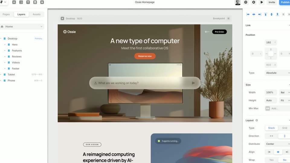
A Framer desktop editor frame shows the Ossie landing page hero: a 3D-rendered desk with a monitor, a glass input bar, and a white headline over a warm room. The view eases with a slight zoom-out as the page settles into place.
Techniques: UI zoom
Camera: Pull out
A close-up of a webpage hero, a monitor on a desk with a floating chat input pill, zooms out to reveal the surrounding design tool, its left layer panel and right property panel appearing at the edges.
Techniques: UI zoom
Camera: Pull out
A design tool canvas displays a webpage mockup; the view scrolls down and zooms into a feature card that gains a blue selection frame, two pointer cursors, and a typed line in its input field.
Techniques: Cursor demo, UI zoom
Camera: Push in
A product interface card showing a 3D head and an agent status, wrapped in a blue selection box with handles, is dragged left across a cream page until it fully enters frame, overlapping the left-side vision text.
On-screen text: “OUR VISION”, “A reimagined computing experience driven by AI-first principles. It's time to get excited about the personal computer again.”, “explore features”
Techniques: Cursor demo
Camera: Pan
A flat UI card with selection handles sits on a cream and peach background, showing a 3D ribbon sculpture, an input field and an Apps button. The handles vanish, a two-line headline fades in above, then the card fades out leaving the text.
On-screen text: “A reimagined computing experience driven by AI-first principles.”, “It's time to get excited about the personal computer again.”
Camera: Pan
Three rounded bars, two white and one pale gray, begin as a tight stack on a cream background and ease apart into an evenly spaced vertical column.
Camera: Static
Three white rounded bars stacked vertically on a pale cream background split and rearrange into a 4x3 grid of white rounded squares. The shapes hold still once the grid is formed.
Techniques: Morph
Camera: Push in
Three rounded cards sit on a pale gray field. The left image card, tagged with a blue 318 x 520 label, widens as a pointer drags its right edge, the label updating to 577 x 589 while the privacy and app-store cards slide into place beside it.
Techniques: Cursor demo
Camera: Push in
A white pill-shaped navigation bar with the Ossie logo, a search field, menu links and an orange Pre-Order button sits on a soft pink-to-blue gradient. The search field widens and the links spread apart while a small blue badge counts down to zero, all inside dashed selection outlines.
Techniques: Cursor demo
Camera: Static
Light pink rounded rectangles slide and resize, settling into a three-column grid over pale vertical bars. The scene cuts to a centered Size panel with Width, Height and Min Max rows, each holding a value and a dropdown control.
Camera: Static
A white Size settings card floats centered on a beige field. Its Width row updates in place, the value changing from 652 to Auto and the blue-outlined dropdown from Fixed to Fill, while the Height and Min Max rows stay static.
Camera: Static
In a static frame, a hand cursor taps the plus icon beside the Breakpoint label, opening a dropdown menu. It then selects the Phone 390 row, which fills blue, over a webpage preview showing a Pre Order button.
Techniques: Cursor demo
Camera: Pull out
A web design interface shows a single desktop view that expands horizontally to reveal three additional narrower device previews side by side. The website layout adapts to fit the different screen widths as the panels slide in from the right.
Techniques: Split screen
Camera: Pan
A Figma canvas displays three responsive artboards of a product landing page, each showing a computer mockup and headline. The view pans horizontally to the right, sliding the desktop, tablet, and phone layouts across the frame.
Techniques: Split screen
Camera: Static
A Figma workspace zooms onto a centered webpage mockup for Ossie while the side panels blur. A progress tooltip counts copied layers at the top, then the mockup flips to a gray wireframe layout.
Techniques: UI zoom, Cursor demo
Camera: Pull out
A design-tool interface shows an Ossie Homepage mockup: a hero with the headline “Brave new world computer.” and a 3D image of hands over a search bar. The frame starts blurred and wide, then zooms in and sharpens; layer and property panels flank the canvas.
Techniques: UI zoom
Camera: Pull out
A website builder window fills the frame with left and right control panels. A cursor clicks Sections in the left list while the center canvas scrolls down through page blocks, a purple section card highlights, then the entire interface blurs out of focus.
Techniques: Cursor demo
Camera: Pan
A flat grid of website mockups on a neutral gray background pans horizontally, columns of cards sliding left to reveal new designs, including a black page with pixel yellow WORK type and a green cartoon character card.
Camera: Pull out
A grid of website mockups fills the frame, then cuts to a laptop on a light wooden desk showing a Framer site with a plant photo. A potted plant and a closed book sit to the right of the screen.
Camera: Pan
A 3D desk set with shelves, plants and a monitor showing a website hero of a worker in a hard hat. The camera pushes into the screen as the page scrolls down, revealing a grid of client logos and the heading One customer platform. Everyone's business.
Techniques: 3D mockup, UI zoom
Camera: Push in
A white browser card with a logo grid and the headline “One customer platform.” sits on a blurred beige background, then morphs into a 3D phone mockup showing the mobile site with a car hero and the lines “Know them. Grow them.” and “Everyone's business.”
On-screen text: “One customer platform.”, “Know them.”, “Grow them.”, “Everyone's business.”
Techniques: Morph, 3D mockup
Camera: Static
A 3D-rendered smartphone sits centered on a soft blurred beige background, locked off. Its screen crossfades from a dark hero page to a white page showing a grid of customer logos, with the tagline One customer platform. Everyone's business. sliding in above a small dashboard mockup.
Techniques: 3D mockup
Camera: Static
White “Framer.com” sits centered on a black field, holding still, then gives way to the small white F logo mark, which lingers and fades to black.
On-screen text: “Framer.com”
Camera: Static
The frame holds on a solid black background with no visible elements, motion, or text. The screen stays uniformly dark for the full duration of the scene.
Camera: Static