0:34

Product Intelligence (Technology Preview)
Linear · Productivity · Aug 2025
Clerk · Mar 2026 · 0:30 · AI-annotated
Clerk’s 0:30 launch film runs 14 scenes, about 2.1 s each. The product shows up at 0:04 and 2 features are revealed. There is no explicit call to action. The video alternates centered type-on-white title cards with dark 3D product renders, pairing each feature phrase with a code or UI demonstration. Cuts run about two seconds per beat, driven by word-by-word gray-to-black text reveals, 3D camera pulls on the sign-in cards, and a recurring violet gradient wash.
Is this your launch? to your site or press kit.
Linear · Productivity · Aug 2025
Airtable · Productivity · Oct 2026
A centered headline on a plain off-white background fades in word by word, each word shifting from light gray to solid dark gray. The frame stays locked off for the full duration.
On-screen text: “It's time you take back”
Techniques: Kinetic type
Camera: Static
A soft violet gradient drifts slowly across the frame behind centered white lowercase type. The word 'control.' holds dead center, paired with the line above it, both locked and still.
On-screen text: “It's time you take back”, “control.”
Camera: Static
A single line of CSS code sits centered on a white background, then a purple swatch and hex value fill in after the colon. The line scales down and shifts to the top-left as six more variable lines and a comment stack in beneath it.
On-screen text: “--clerk-color-primary: #6c47ff;”, “--clerk-color-foreground: #212126;”, “--clerk-color-muted-foreground: #747686;”, “--clerk-color-font-family: “Geist, sans-serif”;”, “--clerk-border-radius: 10px;”, “--clerk-color-success: #15892b;”, “--clerk-color-danger: #e02e2e;”, “/* and a lot more */”
Techniques: Kinetic type
Camera: Static
A dark design-tool properties panel floats in 3D perspective over a white canvas with a black rounded shape. A hand-drawn doodle fades out of the corner radius field as the value counts up from 10 to 18, and a code label scales in.
On-screen text: “--clerk-color-primary:”
Techniques: 3D mockup
Camera: Push in
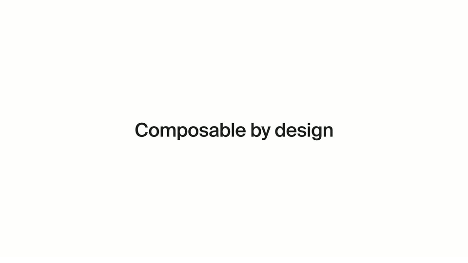
On a plain off-white background, the phrase “Composable by design” sits centered. The first word is solid black while the remaining words fade in from light gray to black.
On-screen text: “Composable by design”
Techniques: Kinetic type
Camera: Static
A centered import code line in monospace, purple and teal accents, holds on a black background while blurred hook names like useSession and useOrganization slide past in 3D depth, the frame tilting gently.
On-screen text: “Composable by design”
Techniques: Parallax
Camera: Static
A dark terminal window titled Claude Code sits centered on a black background, showing a welcome panel and a tips panel. The view zooms into the input line as a command is typed and a skill-load message appears below it.
Techniques: UI zoom
Camera: Static
In 3D perspective, the view opens tight on a dark Continue button. A cursor hovers and a peach glow spreads across the pill, flaring to white. The camera pulls back to show the email field and a Secured by clerk footer.
Techniques: 3D mockup, Cursor demo, Light sweep, UI zoom
Camera: Pull out
A dark sign-in card for Sunset sits centered on a near-black background. The view pulls back from a tight crop on the gradient Continue button to reveal the full form, with a cursor resting on the button.
Techniques: UI zoom, Cursor demo
Camera: Pull out
A frosted-glass sign-in card floats centered on a blurred gray backdrop, tilted slightly in 3D perspective. The card holds a liquidAI mark, a heading, a Slack button with a Last used badge, three social icons, and an email field. It hovers with a soft drop shadow, nearly still.
Techniques: 3D mockup
Camera: Static
A retro Windows 95 login card sits centered on a flat teal field. The gray beveled panel holds a yellow smiley icon, a sign-in heading, three social buttons, an email field and a continue button. The whole card eases in with a small settle, no other motion.
Camera: Static
On a plain off-white background, the centered phrase “Bring your own UI.” builds word by word, each term fading from light gray to solid black before the line holds still.
On-screen text: “Bring your own UI.”
Techniques: Kinetic type
Camera: Static
A purple gradient background, darker at the top and lighter at the bottom, holds a single centered line of text that fades in from translucent lavender to solid white.
On-screen text: “Bring your own UI.”
Camera: Static
On a white field, a small purple icon (an open ring with a center dot and a lower arc) sits centered, then scales up and slides left as the black lowercase wordmark clerk resolves beside it, the first letter filling in from gray. The lockup holds still as a short tagline appears beneath it.
On-screen text: “Bring your own UI.”
Camera: Static