1:00

Introducing Canvas in Gemini
Google · AI · Mar 2025
Skiper UI · Sep 2025 · 0:21 · AI-annotated
Skiper UI’s 0:21 launch film runs 33 scenes, about 0.6 s each. The product is on screen from the first frame. The call to action lands at 0:09 (45% in). The video is a rapid-cut montage of UI component demos on black, paced at 152 BPM with about 120 cuts per minute, framed by the Skiper-UI wordmark at the open and the npx install command plus URL in the middle. Signature moves are scramble text reveals, 3D tilting card mockups, and a recurring gradient orb that anchors each demo.
Is this your launch? to your site or press kit.
Google · AI · Mar 2025
Audora · Consumer · Oct 2026
Tire Swing · B2B · Jul 2026
On a black field, thin white lines slide into a centered crosshair, then the white title Skiper-UI appears at the intersection. The frame is locked off throughout.
On-screen text: “Skiper-UI”
Camera: Static
A black frame with thin white lines drawing a crosshair grid around the centered white wordmark Skiper-UI; the lines fade out, leaving the logo alone.
On-screen text: “Skiper-UI”
Camera: Static
Black background. The centered white line “A whole new era of UI components” starts with its letters doubled and smeared, then snaps into a crisp, locked line.
On-screen text: “A whole new era of UI components”
Techniques: Kinetic type
Camera: Static
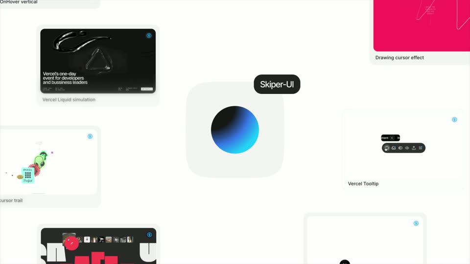
A locked-off grid of UI component cards on a white background. The center white tile holds a blue-to-black gradient sphere with a dark Skiper-UI pill above it. Surrounding tiles show Vercel demos captioned Liquid simulation, Tooltip, cursor trail and Drawing cursor effect.
Camera: Static
A dark blueprint grid frames a half-shaded cyan sphere with thin 30PX spacing guides on each side. The frame flips to white, the sphere takes on a cyan outline, and the wordmark Skiper-UI appears to its right.
On-screen text: “Skiper-UI”, “Vercel's one-day”, “Vercel Tooltip”
Techniques: Masking
Camera: Static
A flat light-gray browser mockup holds three colored dots and a blue gradient circle beside Skiper-UI. The view quickly zooms toward the logo while pale code lines fade in behind the rounded window.
On-screen text: “Skiper-UI”
Techniques: UI zoom
Camera: Static
A giant near-black serif word fills the dark frame at low contrast. A small blue glowing orb drops from the center toward the bottom edge as a horizontal blue light streak flares along the lower border.
On-screen text: “SKIPPED”
Techniques: Light sweep
Camera: Static
A bright cyan mask dissolves over a black frame, revealing two matte white 3D hands reaching from opposite edges toward a small circular Skipperpro badge with a glowing blue orb. The lowercase word beyond fades in to the right of the badge.
On-screen text: “beyond”
Techniques: Masking
Camera: Static
On a black background, centered lowercase text reads “beyond default” in white, then the line slides wider and dims to gray as “shadcn/ui” extends into the full phrase.
On-screen text: “beyond default”, “beyond default shadcn/ui”
Techniques: Kinetic type
Camera: Static
A tilted 3D browser mockup shows a dark photo grid, then a white card slides up from the bottom to reveal a large white and red SHADCN UI wordmark.
On-screen text: “beyond default shadcn/ui”
Techniques: 3D mockup, Kinetic type
Camera: Pull out
A dark rounded card mockup floats on black, rotating from a tilted angle to face-on. A strip of small photo thumbnails and a red teardrop icon sit above large red blocky letters that scramble from FAFFA into VAINT.
On-screen text: “FAFFA”, “VAINT”
Techniques: 3D mockup, Kinetic type
Camera: Static
A dark rounded card tilts in 3D over black, holding a row of small photo thumbnails above red blocky letterforms that scramble between shapes. A thin white line traces the card's lower edge as a second white card slides in from the right.
Techniques: Kinetic type, 3D mockup
Camera: Static
Two tilted interface cards float in 3D on black. The left dark card reveals the red 3D word KHATAM behind a row of thumbnails, while the right white card scrolls its component list with red underline strokes. The white command above slides down as the cards rise.
On-screen text: “npx shadcn add @skiper-ui”
Techniques: 3D mockup, Masking, Parallax
Camera: Static
A white monospace command line sits centered on a black background. The first half of the line dims to gray as the package name @skiper-ui slides in larger and brighter at the center.
On-screen text: “npx shadcn add @skiper-ui”, “@skiper-ui”
Techniques: Kinetic type
Camera: Static
A black background holds a white centered handle that slides, then the URL appears in the same centered position. The frame stays locked off, and the text changes without any other motion.
On-screen text: “@skiper-ui”, “https://skiper-ui.com”
Techniques: Kinetic type
Camera: Pull out
A light gray card with a black-to-cyan gradient dot and an install command zooms and inverts into a black frame. A cyan curved spotlight shape frames a white SKIPERPRO laurel badge that settles at center.
On-screen text: “Available with shadcn CLI 3.0”
Techniques: Morph
Camera: Static
A blue gradient sphere sits centered on a dark grid with 30PX spacing guides; a dark rounded toolbar of line icons then takes its place as a black cursor appears at lower left.
Techniques: Cursor demo
Camera: Static
A black cursor moves up to the chat icon of a dark pill-shaped toolbar. A row of six circular icons, some dark with crescent or bulb glyphs, pops in above the bar as the background shifts from white to gray.
Techniques: Cursor demo
Camera: Static
A dark recording toolbar with circular icons and a Recording Saved tooltip sits centered, then cuts to a grid of icon buttons with a large +39,843% figure and small instructional text above, a cursor waiting below.
Techniques: Cursor demo
Camera: Static
A plain off-white screen shows the gray word bonjour centered, with a small black cursor arrow resting in the lower right corner.
Camera: Static
A dark swap panel showing Ethereum to Aave with a zero amount cuts to a 2x2 grid of balance cards in purple, dark, teal and blue. A cursor hovers the menu dots on the purple Gxuri card.
Techniques: Cursor demo
Camera: Static
A dark window frame holds the white headline “Your data is” above three rows of rounded gray placeholder bars of decreasing brightness. A mouse cursor rests in the lower right corner. The frame stays static.
On-screen text: “Your data is”
Camera: Static
A white page shows a large black 0:60 countdown under a small gray label, which quickly clears to reveal a bold black headline, We Design the Vercel platform, beside a light-gray list of six items; a cursor rests at the lower right.
Camera: Static
Dark gray monospace text and a thin LOADER bar flip to a pale green screen; the text vanishes, the loader becomes a white card of dark squares at 100%, and the info card swaps copy for a boxer photo. Rotated sticky notes hold the corners.
On-screen text: “WITH ♥ FROM PUNJAB, INDIA”, “LOADERS, SHADERS, GREAT UI/UX COLLECTION SEP 2025”
Camera: Static
On a black landing page, a glossy liquid-metal ribbon trails the mouse cursor and reshapes as it moves, beneath a small move-your-mouse hint. A fixed bar at the bottom holds the event headline, date, location and a Get Tickets button.
Techniques: Cursor demo, Morph
Camera: Static
A horizontal row of flat poster cards, led by a large white card reading Italy, scrolls upward off the top of a white frame. As they rise, a dense crowd of black-and-white cartoon faces, a few tinted purple and green, fills the lower half.
On-screen text: “made with”
Techniques: Parallax
Camera: Static
A grid of 3D emoji-style objects on a light gray background scrolls diagonally down and left, revealing new items row by row. A small white card with a cursor sits at the center in the opening frame.
On-screen text: “made with”
Camera: Static
A dark webpage scrolls upward. A bold white 'CRAZY COMPONENTS' headline and a grid of image tiles (a phone in hand, a sunset portrait, a colorful radial wheel) drift up at different speeds, with a small 'GSAP PERSPECTIVE SCROLL EFFECT' label and 'SCROLL DOWN TO SEE' prompt at the top.
Techniques: Parallax
Camera: Static
On a magenta canvas, a chunky maroon “Draw” word and a few floating cubes give way to a curved row of app icons, with a small caption above them.
Camera: Static
A row of colorful app icons bobs gently on a plain white background beneath a caption set in curly braces. A small black cursor rests just below the icons on the right.
On-screen text: “{ integrate with your fav tech stack }”
Camera: Static
A dark website hero with a row of square photo thumbnails and a large white-and-red wordmark scrolls downward, revealing a light Terms and Conditions document with a left index menu. A red italic Marathi tagline stays fixed along the bottom edge through the transition.
Techniques: Parallax
Camera: Static
A dark code editor view fills the frame with syntax-highlighted JavaScript on both sides. A white serif heading on the left explains the scroll effect, and a glowing blue sphere hovers in the center, static over the short clip.
On-screen text: “The anime.js landing page shows you how to create cards that pop up as you scroll down to your blogs, portfolio or progress in a fun way.”
Camera: Static
A locked-off white grid of UI demo cards centers on a rounded tile holding a blue-to-black gradient orb, marked by a black pill label. Surrounding tiles show a dark liquid simulation, a pink drawing panel, a tooltip bar and a cursor trail, each under a small gray caption.
Camera: Static