0:28

Juicebox | AI Recruiting Platform | Motion Design ADS
Juicebox · Oct 2026
Buildkit · Oct 2026 · 0:40 · AI-annotated
Buildkit’s 0:40 launch film runs 15 scenes, about 2.7 s each. The product is on screen from the first frame and 5 features are revealed, with social proof. The call to action lands at 0:36 (90% in). The video runs as a logo sting, four feature blocks of title card plus live demo, a proof card, and a locked-off CTA, cut at about 7.5 cuts per minute. Signature moves are the diagonal panel wipes, the 3D card morphs, and the code pills that swap props as the UI recolors.
Is this your launch? to your site or press kit.
Juicebox · Oct 2026
Voyager · B2B · Oct 2026
Navier AI · Nov 2026
A white and purple logo mark assembles in the center of a dark radial glow. The wordmark Buildkit slides in beside it, then the smaller grey text for Astro fades in.
On-screen text: “Buildkit”, “for Astro”
Camera: Static
On a dark field with a faint dot grid, the Buildkit mark and wordmark hold with a gray “for Astro” tagline. The mark then scales up inside a vertical purple panel while oversized gray and white shapes slide in from the right edge.
On-screen text: “Buildkit”, “for Astro”
Techniques: Masking
Camera: Static
Faint wavy contour lines and a soft purple glow fill a black frame. A small pill labeled “Introducing Buildkit” sits above a large headline that fades in line by line, “AI agent” highlighted in a purple box, then a smaller gray subtitle line appears below.
On-screen text: “Introducing Buildkit”, “The Astro design system”, “your Al agent already knows.”, “Core blocks, backgrounds, and animated visuals for Astro.”
Techniques: Kinetic type
Camera: Static
On a dark field of faint wavy lines, a pill badge and a two-line white headline sit still, “AI agent” boxed in purple. A gray subhead lines the bottom. A diagonal purple panel wipes up across the frame, revealing a light browser window with an arc.com address bar.
On-screen text: “Introducing Buildkit”, “The Astro design system”, “your AI agent already knows.”, “Core blocks, backgrounds, and animated visuals for Astro.”
Techniques: Masking
Camera: Static
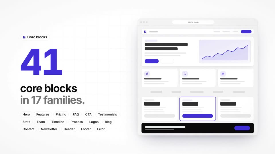
A split layout: left, an indigo 41 assembles above 'core blocks in 17 families.' under a 'Core blocks' pill; right, a browser mockup builds up with a hero chart, feature cards, a highlighted card and black footer, while pill labels fade in below. The shot ends on a slow push-in.
On-screen text: “Core blocks”, “41”, “core blocks”, “in 17 families.”, “Hero”, “Features”, “Pricing”, “FAQ”, “CTA”, “Testimonials Stats Team Timeline Process Logos Blog Contact Newsletter Header Footer Error”
Techniques: Kinetic type, Split screen
Camera: Static
A tilted 3D browser window holding a dashboard mockup pans and fades out as a matching 3D card slides in to fill the frame. The card carries a pill tag, a bold headline, two buttons, and a small signups line chart, all set against a plain light background with a soft drop shadow.
Techniques: 3D mockup
Camera: Push in
A hero mockup card under a fixed headline. The left visual morphs from a line-chart card to a gradient panel, then to a dark dotted globe with a purple arc drawn around it, while the copy block flips sides. A code tag below names the swapped prop.
On-screen text: “One core block. Many designs.”
Techniques: Morph
Camera: Pull out
Resolving from a horizontal blur, a cream layout pairs a bold two-line headline on the left with a stack of dashboard cards on the right. A dark code pill cycles theme names as the cards recolor from green to orange to pink.
On-screen text: “9 themes, plus your brand.”, “THEME.name = ”
Camera: Pan
A light layout pairs a headline and code pill left with four UI cards right. The code cycles theme names as card colors shift from purple to indigo and orange. A cursor clicks a Dark mode toggle; everything fades to black, the headline crossfades, cards turn dark.
On-screen text: “9 themes, plus your brand.”, “THEME.name = ”
Techniques: Cursor demo
Camera: Static
A bold white headline '19 backgrounds that stack.' sits left of an isometric stack of four translucent planes that separate into layers, each tagged by a small gray label on the right. The camera then dives into the top noise plane, filling the frame with purple static.
On-screen text: “19 backgrounds”, “that stack.”, “BackgroundSolid”, “BackgroundMesh”, “BackgroundTopography”, “BackgroundNoise”
Techniques: 3D mockup, UI zoom
Camera: Push in
On a dark field of thin white contour lines, a bold white headline wipes in at the top. Four dark UI cards stagger in beneath it, each with a label: an area chart with a counting number, a dotted sphere, a purple app icon, and a phone clock.
On-screen text: “60 animated visuals, included.”
Techniques: Kinetic type, Particles
Camera: Static
Six dark UI cards (line chart, dotted globe, integrations hub, phone, terminal, checklist) sit under a white headline. The grid zooms in, then reframes into a split layout: a left headline and a right terminal that types a command.
On-screen text: “60 animated visuals, included.”, “Your agent builds a site.”
Techniques: UI zoom, Kinetic type, Split screen
Camera: Push in
Dark split layout: on the left, a bold white headline and gray subline fade in above three pill badges; on the right, a terminal window types a build command, prints status lines, and fills a progress bar before blurring out.
On-screen text: “Your agent builds the site.”, “Guided by skills, not guesswork.”, “Works with”, “Claude Code”, “Codex”, “Cursor”
Techniques: Kinetic type, Cursor demo
Camera: Static
On a dark background, eight circular avatar photos sit in a row above a bold headline whose number rolls in and settles at 20,000+. Below, a small gray caption and a row of tool logos (Astro, Tailwind CSS, shadcn/ui, TypeScript, Lucide, Motion) slide into place.
On-screen text: “Pixelcave products are trusted by 20,000+ people”, “Built on the tools you already use”
Techniques: Kinetic type
Camera: Pull out
On a dark radial field of thin concentric rings and a soft purple glow, the Buildkit wordmark and icon assemble at center as small dots drift. The tagline, a purple Get Buildkit button, and the URL fade in below, then hold on a locked-off frame.
On-screen text: “Build all your websites better.”, “Get Buildkit →”, “astrobuildkit.com”
Techniques: Kinetic type, Particles
Camera: Static