1:17

Reconero: Supercharge your police force with AI
Reconero · Government · Oct 2026
Angular Native · Sep 2026 · 0:39 · AI-annotated
Angular Native’s 0:39 launch film runs 18 scenes, about 2.2 s each. The product shows up at 0:01 and 9 features are revealed. The call to action lands at 0:33 (86% in). The video is built as a logo sting, a rapid run of single-feature beats with the headline left and a live demo right, a word-wall recap, and a closing CTA lockup, all cut to a steady beat near 118 BPM. Signature moves are diagonal edge wipes, 3D depth pushes on red gradients, and typing code pills that drive the UI in sync.
Is this your launch? to your site or press kit.
Reconero · Government · Oct 2026
ByteAsk · B2B · Nov 2026
Stoa · Fintech · Jul 2026
The word Introducing sits centered on a black background and scales up from a small size to full size, then holds still. The frame is locked off with no camera movement.
On-screen text: “Introducing”
Techniques: Kinetic type
Camera: Static
On a black background, a red dot swells into a glowing red disc. Angular white and pink shards fly in from the edges and assemble into an abstract face-like mark. A thin horizontal line crosses the frame.
Camera: Push in
The red Angular mark sits centered in a thin white ring on a black field. The ring drops and the mark slides left as “Angular Native” builds in beside it, white then red, with a small gray tagline fading in below. The whole lockup defocuses into a soft red blob.
On-screen text: “Angular Native”, “Angular apps, rendered as real native iOS and Android views.”
Techniques: Kinetic type
Camera: Push in
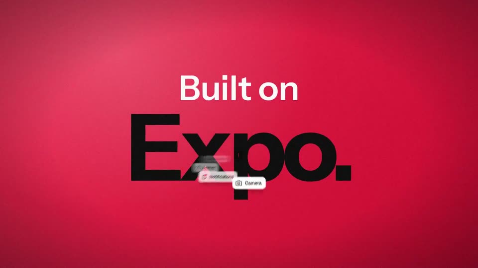
On a red gradient background, the words Built on and Expo. fade in centered, then the lockup blurs and tilts into a 3D perspective, revealing floating UI module labels arranged in depth.
On-screen text: “Built on”, “Expo.”
Techniques: Kinetic type, Parallax, 3D mockup
Camera: Static
On a red gradient, a black code card cycles through inject() lines at the center of a curved 3D ring of white module chips. Each new line types in as its matching chip flashes black, then the card pushes forward and blurs out.
On-screen text: “Built on Expo.”, “Every Expo module. Supported out of the box.”
Techniques: Kinetic type, 3D mockup, UI zoom
Camera: Pan
Top left, the headline 'Real CSS. Compiled to native.' anchors a code editor that highlights CSS lines in turn, while a phone mockup on the right restyles its wallet card with a pink gradient, rounded corners and dark rows. Monospace tags pop in down the right edge per line.
On-screen text: “Real CSS.”, “Compiled to native.”, “oklch()”, “var(--*)”, “linear-gradient()”, “box-shadow”, “transition”, “nesting”, “:active”, “:nth-child())”
Techniques: Split screen, Light sweep
Camera: Static
Dark split layout: left holds the headline 'Real CSS. Compiled to native.' over a code editor window; right holds a phone mockup of a Wallet app with a pink gradient card and a tag column. The left block slides left and fades out while the phone and tags hold still.
On-screen text: “Real CSS. Compiled to native.”, “oklch()”, “var(--*)”, “linear-gradient()”, “box-shadow”, “transition”, “nesting”, “:active”, “:nth-child()”, “color-mix()', '@keyframes', '@media', 'dark mode' placeholder”
Techniques: Split screen
Camera: Static
Two flat phone mockups labeled iOS and Android sit side by side under the headline “Tailwind, built in.” A black code pill types a class string as the balance card fills with a rose-to-violet gradient; the Android label turns green and a faint ring mark fades in.
On-screen text: “Tailwind, built in.”, “iOS”, “Android”, “class=”
Techniques: Kinetic type, Split screen
Camera: Pull out
A black frame fades up to a bold headline 'Your app, in the browser.' with a pink handle and a code chip, beside a 3D phone mockup showing a purple wallet card and list, in front of an empty browser window. The phone drifts right.
On-screen text: “@ng-native/web”, “Your app, in the browser.”, “mount(root, App);”
Techniques: 3D mockup, Masking
Camera: Static
A tilted phone showing a wallet app slides right across a flat browser window that zooms in, on a black background. The headline “Your app, in the browser.” fades out as “The app.” appears top left.
On-screen text: “@ng-native/web”, “Your app, in the browser.”, “The app.”
Techniques: 3D mockup, UI zoom
Camera: Push in
A front-facing phone mockup on a dark stage shows a Wallet screen with a purple balance card and a dashed web-view box. A black signature draws itself across the signature field while annotation lines label the native and web views, then a white panel wipes in from the right.
On-screen text: “DOM components”, “The browser, in your app.”, “<dom-component [src] = 'signature' />”, “Native views”, “Web view”
Camera: Static
A light gray frame holds a bold black headline on the left with a small pink monospace tag above it. On the right, a 3D mockup of phone screens slides between Inbox, Thread and Reply views as pink diagonal bars wipe in from the right edge.
On-screen text: “@angular/router”, “Native navigation.”
Techniques: Kinetic type, 3D mockup
Camera: Static
On a crimson gradient background, the white headline “Signal Forms.” settles into place on the left while a white form card on the right types “Ada Lovelace” into the Name field and flips the Notify me toggle on, as a dark diagonal band sweeps in across the right edge.
On-screen text: “@angular/forms”, “Signal Forms.”
Techniques: Kinetic type, Masking
Camera: Static
On a dark field, a flat phone mockup on the right switches its background from purple to blue while a code pill beside it updates the hex value to match. The white headline Hot reload. and a small pink Metro + Expo label hold still on the left.
On-screen text: “Metro + Expo”, “Hot reload.”
Camera: Static
A light gray card holds a pink monospace tag and a large black headline that snaps into focus on the left, while a dark code panel on the right fills in its checkmark lines and a faint diagonal watermark drifts across the right edge.
On-screen text: “@ng-native/testing”, “Test in Node.”
Techniques: Kinetic type
Camera: Static
A black screen holds a dense diagonal wall of feature words in white and red, drifting slowly toward the lower right over a dimmer layer of smaller grey terms. Larger words like Clipboard, Gradients and Media queries lead, with red accents on Tailwind and Hot reload.
On-screen text: “SwiftUI”, “Camera”, “Transitions”, “SQLite”, “Filters”, “Tailwind”, “Hot reload”, “Gradients”, “Worklets”, “Native rendering”
Techniques: Kinetic type, Parallax
Camera: Pull out
A dense cloud of feature names in white and pink sans-serif fills the black frame at mixed sizes. The cloud dims to near black as the red Expo mark and wordmark fade in at center with a soft red glow.
Camera: Pull out
Faint red feature words drift on a dark background. The Angular shield logo and wordmark reveal in the center, then a tagline with a red alpha pill and an underlined URL fade in below, and a terminal command types itself out with a blinking caret.
On-screen text: “Angular Native”, “Now available in”, “alpha”, “ng-native.com”, “npx create-expo-app@latest --template @ng-native/template”
Techniques: Kinetic type, Parallax
Camera: Static