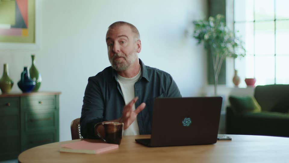
0:33
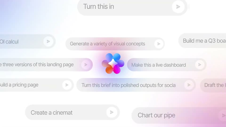

ClickUp Artifacts Feature Launch Video
ClickUp · Productivity · Oct 2026
Anthropic · Apr 2026 · 1:21 · AI-annotated
A launch video for Claude Design built as a fast cursor-driven tour of the editor: a typed prompt generates a 3D globe landing page, then each toolbar tool (Tweaks, Comment, Knobs, Export) is demoed on a different project, with drifting walls of project windows as transitions and serif status captions (Soldering, Dimming) marking the AI work. The style is defined by a warm cream base that flips to near-black for the globe scenes, peach-orange accent buttons, smooth push-in and pull-back camera,
ClickUp · Productivity · Oct 2026
OpenAI · AI · Sep 2026
Shopify · Business software · Dec 2025
A cream background holds a rounded pill button with a black palette icon and the word Design. A gray cursor arrow rises from the bottom edge to hover the button, which darkens and gains a thin outline ring.
Techniques: Cursor demo
Camera: Static
A white prompt card with a placeholder line and a row of icon buttons sits on a cream background. A cursor clicks the field, then a prompt is typed in while the backdrop fades to black with a faint globe outline.
Techniques: Cursor demo
Camera: Pull out
A white chat card sits centered over a dark rotating globe. Two file chips and a prompt fill the box, the text typing out letter by letter with a blinking caret. A mouse cursor glides in and hovers over the orange Send button.
Techniques: Cursor demo
Camera: Pull out
A white rounded progress card floats centered over a dark 3D globe. The status text flips from Designing to Tweaking while the Import button fades out, then the card shrinks to a small square holding the orange starburst mark as cyan arcs link city dots on the globe.
Camera: Pull out
A full app window shows a chat sidebar left and a dark landing page preview with a glowing connection globe right. A cursor hovers over the preview, then the camera zooms in on the preview until the globe and headline fill the frame.
Techniques: Cursor demo, UI zoom
Camera: Push in
A white arrow cursor glides up from a dark 3D globe covered in cyan network arcs and stops on the Tweaks button, which highlights as the cursor becomes a pointing hand.
Techniques: Cursor demo
Camera: Push in
Close-up of the Claude interface over a dark globe map. A cursor clicks the orange Tweaks button, a white dialog pops in, and a prompt is typed into the text field while the cursor hovers.
Techniques: Cursor demo
Camera: Static
A white modal dialog with an input field and buttons appears over a dark 3D globe. A cursor clicks the orange Send button, and the dialog shrinks into a smaller, rounded input field.
Techniques: Cursor demo, Morph
Camera: Static
A cream screen shows the serif word Soldering beside an orange starburst that morphs into a dotted spinner, then a task panel scales in with five checkbox items under a Claude heading.
Techniques: Morph
Camera: Static
A Claude task panel tilts in 3D on a cream backdrop. The camera zooms into the checklist as green checkmarks pop onto each row and a strikethrough crosses the text, marking tasks complete, while the final row stays an empty box.
Techniques: 3D mockup, UI zoom
Camera: Push in
A pale checklist card on a cream background zooms out to reveal its rounded corners and full padding. Five rows each pair a green checkmark square with gray strikethrough task text.
Techniques: UI zoom
Camera: Pan
A dark 3D globe with glowing teal arcs linking labeled city nodes turns slowly on the left. On the right, a floating tweaks panel assembles section by section: theme and breakpoint toggles, then network sliders, checkboxes and globe settings. Step captions scale in one after another.
On-screen text: “Read current page layout and components”, “Build tweaks state with defaults”, “Create floating tweaks panel UI”, “Add arc and city toggle controls”, “Add breakpoint viewport switcher”
Techniques: Kinetic type
Camera: Pull out
A dark 3D globe with cyan flight arcs and city labels rotates slowly on the left. On the right, a settings panel with sliders and checkboxes scrolls up slightly.
Techniques: 3D mockup
Camera: Static
A tight crop on a dark globe of teal city arcs and a settings panel zooms out to reveal the full editor: a chat column on the left, a landing page with a glowing globe in the center, and the control panel on the right.
Techniques: UI zoom
Camera: Pull out
Inside a design tool, a dark canvas shows a teal 3D globe of network arcs under the headline Every place has a story. A cursor clicks a breakpoint pill and drags sliders in the right-hand Tweaks panel; the globe shrinks and recenters as the layout reflows.
Techniques: Cursor demo
Camera: Pull out
A dense grid of app and document windows fills the frame, the camera drifting across the wall of screens. In the lower right, a document reveals italic serif lines about a plaque written for future readers.
Camera: Push in
A wide shot of a prototype builder shows a chat panel beside a phone mockup, then the view zooms into the chat and scrolls down to reveal the assistant's summary of the built meditation app.
Techniques: UI zoom
Camera: Pan
Split view of an AI agent panel on the left and a flat phone mockup of a meditation app on the right, with a tweaks sidebar. The frame settles from a ghosted overlay, then a hand cursor taps the Profile tab at the bottom of the phone.
Techniques: Cursor demo
Camera: Pull out
In a flat prototyping editor, a phone mockup of a meditation app sits beside a TWEAKS panel. The view zooms onto the player screen as a cursor taps the Play tab, then picks the Moss swatch, shifting the phone's tint to green.
Techniques: UI zoom, Cursor demo
Camera: Push in
A close-up of a toolbar where a hand cursor taps the Comment button, then the Edit text button, each flashing a peach highlight on press.
Techniques: Cursor demo
Camera: Static
A close-up of an orange Comment button and a hand cursor reframes outward to a flat layout: a phone mockup on the left and a TWEAKS panel on the right showing theme swatches and typography sliders, with an arrow cursor at the top.
Techniques: Cursor demo, UI zoom
Camera: Pan
A tweaks panel with theme swatches and type sliders sits beside a phone screen. A comment box types out a request while a hand cursor taps the orange Send button. The view cuts to a cream screen with an orange asterisk and the word Dimming.
Techniques: UI zoom, Cursor demo
Camera: Pan
An orange starburst logo and the italic serif caption “Dimming...” hold centered on a cream field. A phone screen and a tweaks panel fade in on either side, and the cursor drifts to the panel's lower corner.
On-screen text: “Dimming...”
Techniques: Kinetic type
Camera: Static
A flat phone mockup on the left plays the Forest Rain soundscape with a circular timer ring, while a TWEAKS settings card on the right lists theme swatches and typography sliders; two cursors glide toward the Dark mode toggle.
Techniques: Cursor demo
Camera: Static
A phone screen showing a sleep soundscape sits beside a settings panel. A hand cursor taps the Dark mode toggle, then the pointer slides down to hover over the Sakura theme swatch.
Techniques: Cursor demo
Camera: Static
A close-up of a dark phone player and tweaks panel pulls back to reveal a design-tool canvas with top toolbar and sidebars. A cursor hovers over the heading-size slider.
Techniques: UI zoom
Camera: Pull out
A flat grid of product interface mockups, each a different project: a 3D forest scene, a dark meditation player, a text document, a glowing DNA helix. The whole grid drifts slowly to the right and up across the frame.
Camera: Pull out
A wall of floating interface panels in 3D perspective, including a 3D globe, a forest retreat page, a dark network sphere and a low-poly house render, drifts past as the camera glides sideways through the field.
Techniques: 3D mockup, Parallax
Camera: Push in
A product screen shows a document editor: an AI chat panel on the left, a company offsite document with a forest cover photo in the center, and a schedule list on the right. The view eases in on the document as the cursor moves across the page.
Techniques: Cursor demo, UI zoom
Camera: Push in
A row of rounded toolbar buttons sits on a cream background. A hand cursor rises from below and taps the Comment button, which fills orange with white text as the cursor settles.
Techniques: Cursor demo
Camera: Static
A comment card over the document page reads “Swap this to the coastline photo” above Discard, Queue and Send buttons. The card slides away, the hero photo swaps from a redwood trail to a Big Sur coastline, and the view pushes in on the page.
Techniques: UI zoom
Camera: Push in
A horizontal row of rounded pill buttons labeled Comment, Edit text, Knobs and Draw slides left across a cream field. A black arrow and a white pointing-hand cursor travel with the row, and the hand taps the Knobs button, which fills solid orange.
Techniques: Cursor demo
Camera: Static
A close-up of a website mockup shows a Knobs typography panel while a cursor hovers over the font fields. The frame cuts to a white card where Edit text, Knobs and Draw slide in beside a gear and a pencil icon.
On-screen text: “Edit text”, “Knobs”, “Draw”
Techniques: Cursor demo, Kinetic type
Camera: Static
Three white pill buttons labeled Comment, Edit text and Knobs sit in a row on a cream background, sliding into place. A hand cursor hovers over the middle button, which fills with a soft pink highlight.
Techniques: Cursor demo
Camera: Static
One product editor window sits center frame with a faded echo behind it, then the view pulls back to a wall of project windows. A dark stat card scales in over the grid, its number counting up to 3,200+, then the card clears to leave the grid and a cursor.
On-screen text: “3,200+”
Techniques: Kinetic type
Camera: Pull out
A tiled grid of app windows recedes in depth, then the view pushes into a single window. A comment card pops up over a dark slide reading 3,200+, and a cursor moves to the Send button.
Techniques: Parallax, UI zoom, Cursor demo
Camera: Push in
A white comment card fills the frame on a blue-gray background, holding a text field and Discard, Queue and orange Send buttons. A hand cursor rests on Send as the card slowly zooms in, cropping the bottom row.
Techniques: Cursor demo, UI zoom
Camera: Push in
The view starts on a pitch slide whose bar chart switches into a line, then pulls back to reveal the editor toolbar. A cursor clicks Export, opening a dropdown menu, and hovers over Export as PPTX.
Techniques: Morph, UI zoom, Cursor demo
Camera: Push in
A close-up of a design tool shows an open Export dropdown with options such as PDF, PPTX and standalone HTML, while two hand cursors hover over the rows. The document behind, titled Hemlark Retreat '26, scrolls up slightly.
Techniques: Cursor demo
Camera: Static
A dark app screen shows a phone mockup on the left and a slider panel on the right. An export dropdown menu is open at the top right; a hand cursor hovers over its entries, moving from one item to another as the menu shifts upward.
Techniques: Cursor demo
Camera: Static
A product interface displays a dark globe map with cyan connection lines and city labels. The Export dropdown is open at the top right, and a hand cursor hovers over the highlighted 'Handoff to Claude Code' row as the menu re-renders with coding-agent options.
Techniques: Cursor demo, UI zoom
Camera: Pull out
A cursor clicks the Copy command button in a central Send to local coding agent modal over a dark globe landing page. The modal closes, revealing the full page with the headline Every place has a story on the left and a glowing wireframe globe on the right.
Techniques: Cursor demo
Camera: Pull out
A wall of small interface windows fills the frame, each a different project view: chat threads, 3D scenes, dashboards and article pages. The grid slowly pulls back to expose more panels, with small cursors resting in a few windows.
Camera: Pull out
Interface mockups of the design tool scatter outward and off frame, clearing to a plain cream background where a palette icon and the word Design hold center.
On-screen text: “Design”
Camera: Static
A line-drawn palette icon and the wordmark Design sit centered on a cream field. The tagline beneath types out to read by Anthropic Labs, ending with a small orange dot beside the g.
On-screen text: “Design”, “by Anthropic Labs”
Techniques: Kinetic type
Camera: Static
On a warm cream background, a coral starburst mark holds center as the black serif wordmark Claude fades in to its right; the mark rotates slowly through the hold.
On-screen text: “Claude”
Camera: Static